← WorldsJuliette Brieau↓
Juliette Brieau
- Client
- Juliette Brieau
- Year
- 2026
- Role
- Art direction · visual identity
- Category
- Brand identity · website
- Location
- Paris region, France
- Web design
- Mathilde Langle
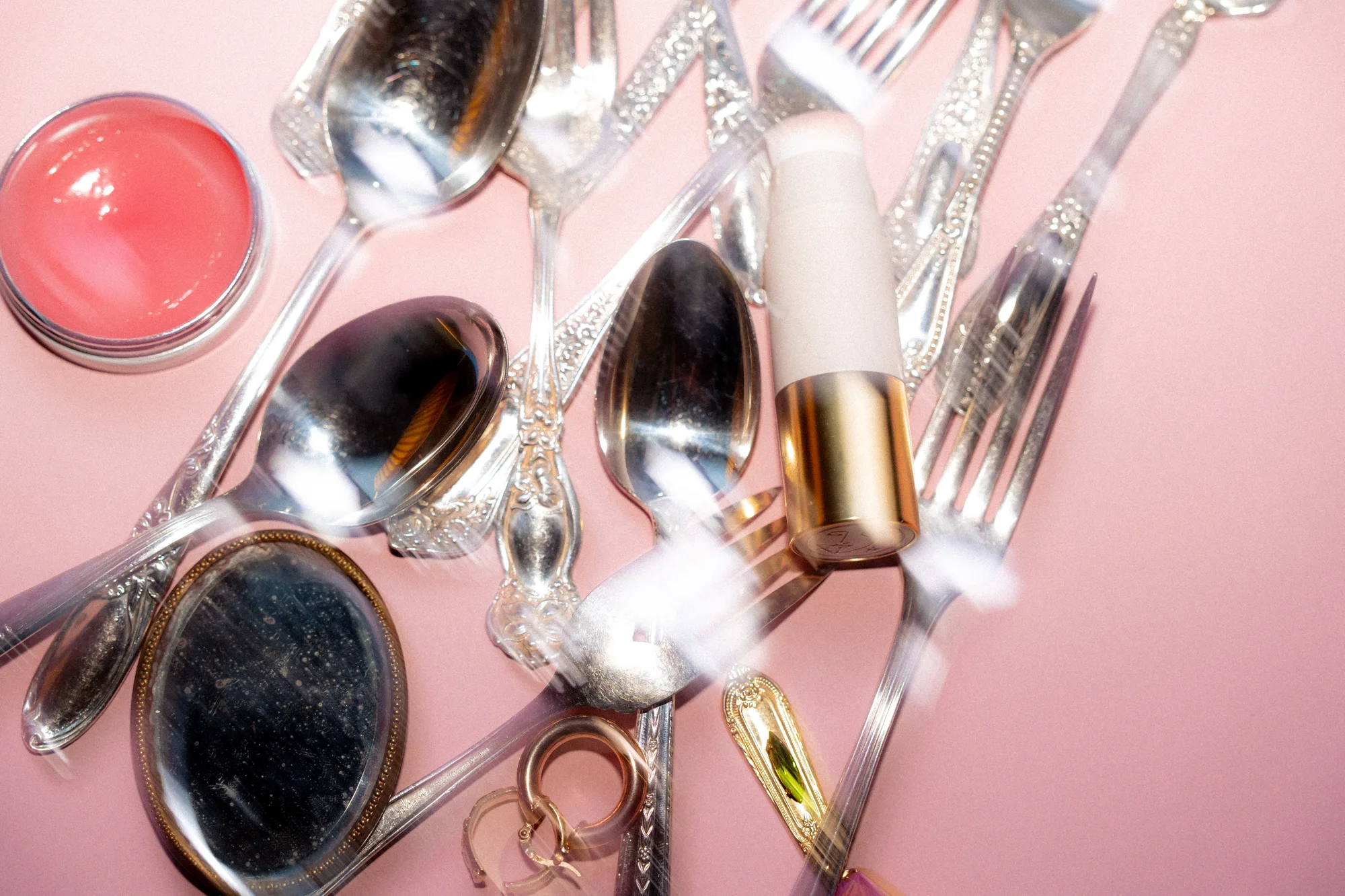
Juliette hunts for vintage cutlery, engraves her customers’ words on it by hand, paints ceramics and wraps every order like a letter. After nine years and more than 28,000 orders, Les Petites Cuillères de Juliette became Juliette Brieau: a personal brand able to bring all her crafts together under one name, her own.
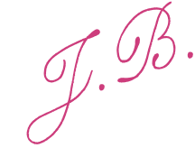
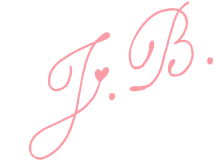
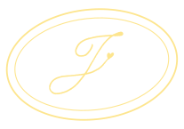
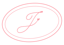
I wanted an art direction that is more structured, more mature and cleaner, without erasing the poetry and fantasy that make her world so strong. A calligraphic serif logo, like a signature; a “J” adorned with the heart she draws on her own j’s, turned into a seal inspired by the tiny gilded frames she collects; bold colours where pastel meets neon, as in her home, her wardrobe and her ceramics; little hand-drawn ornaments. Vintage, always, with a mischievous touch of pep.
(01)
Inspirations
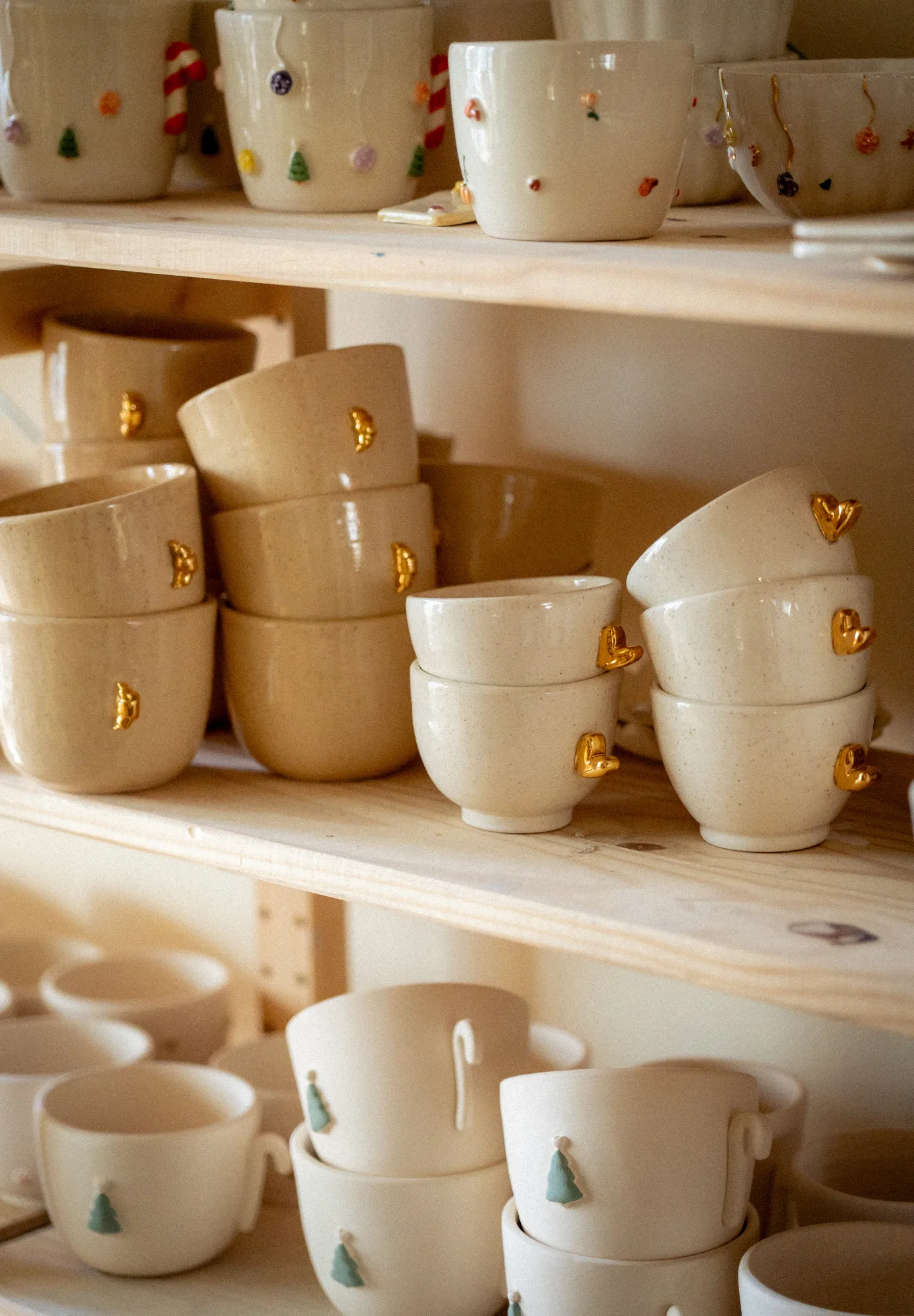
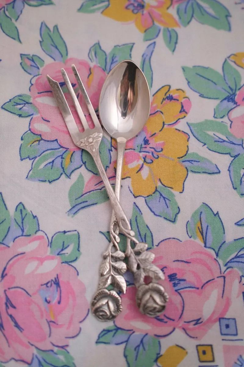
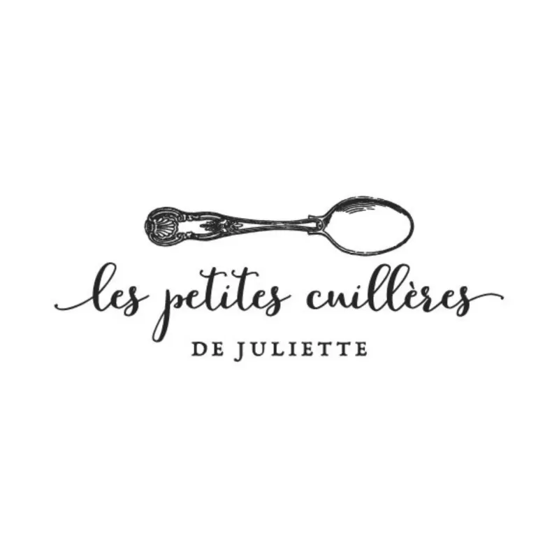
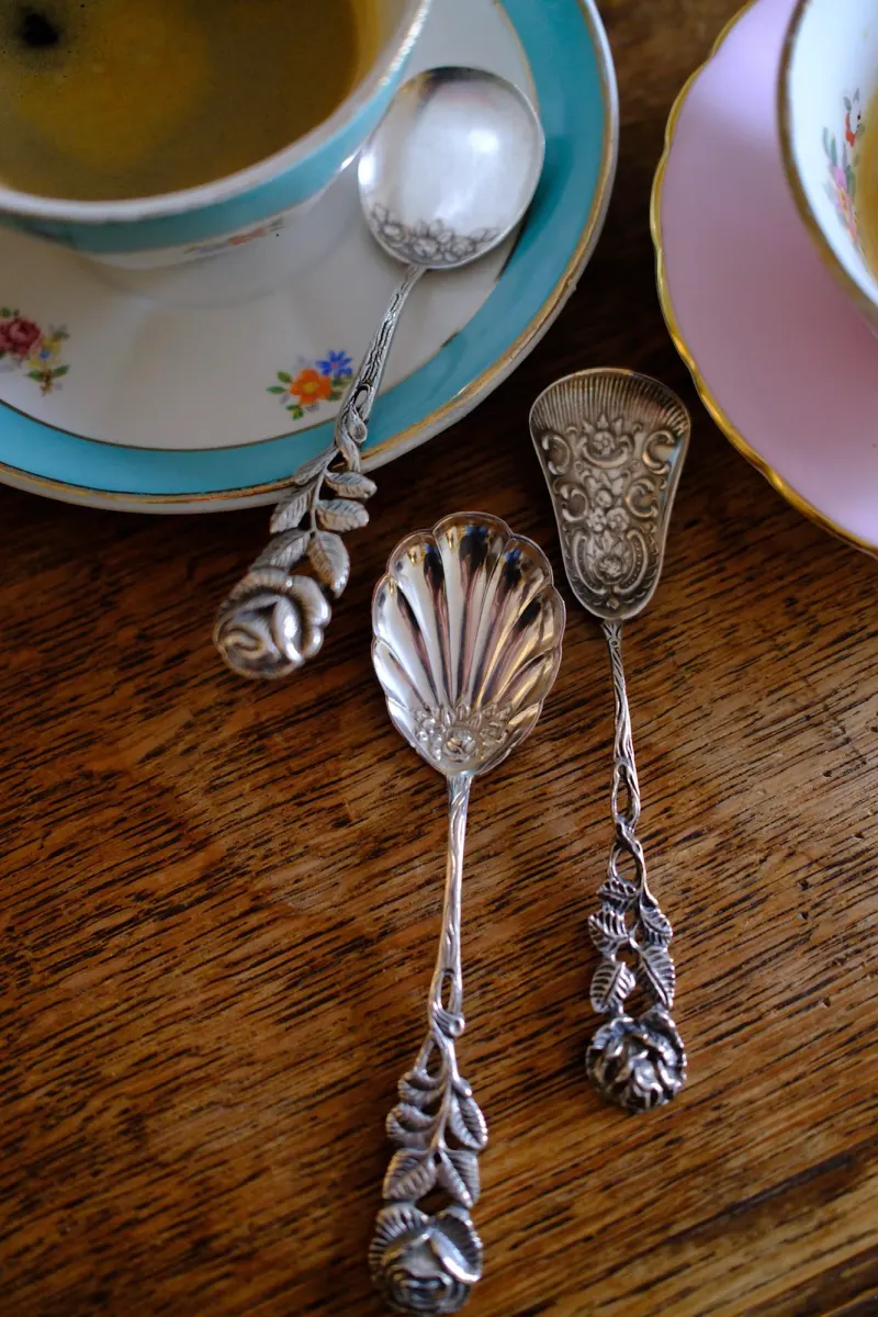
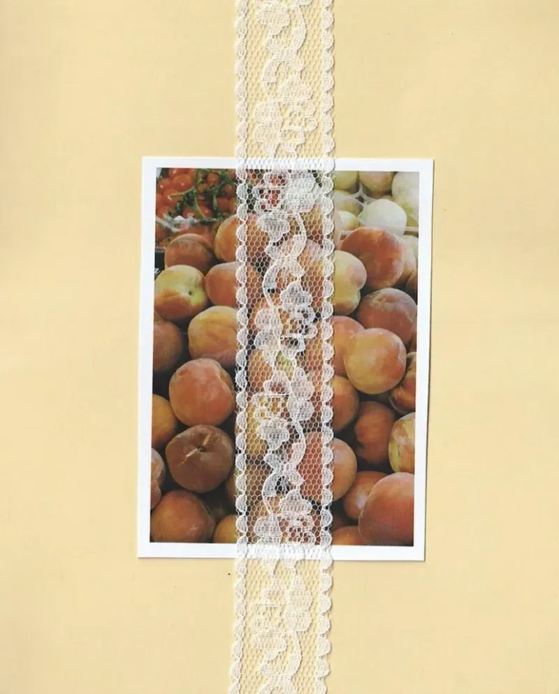
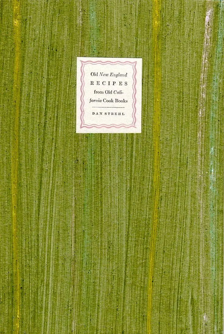
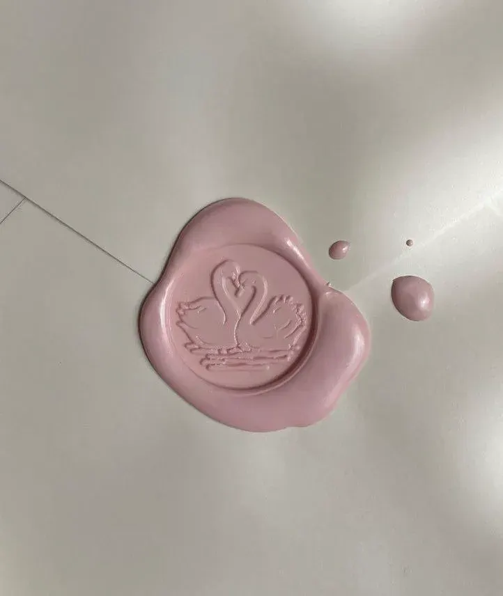
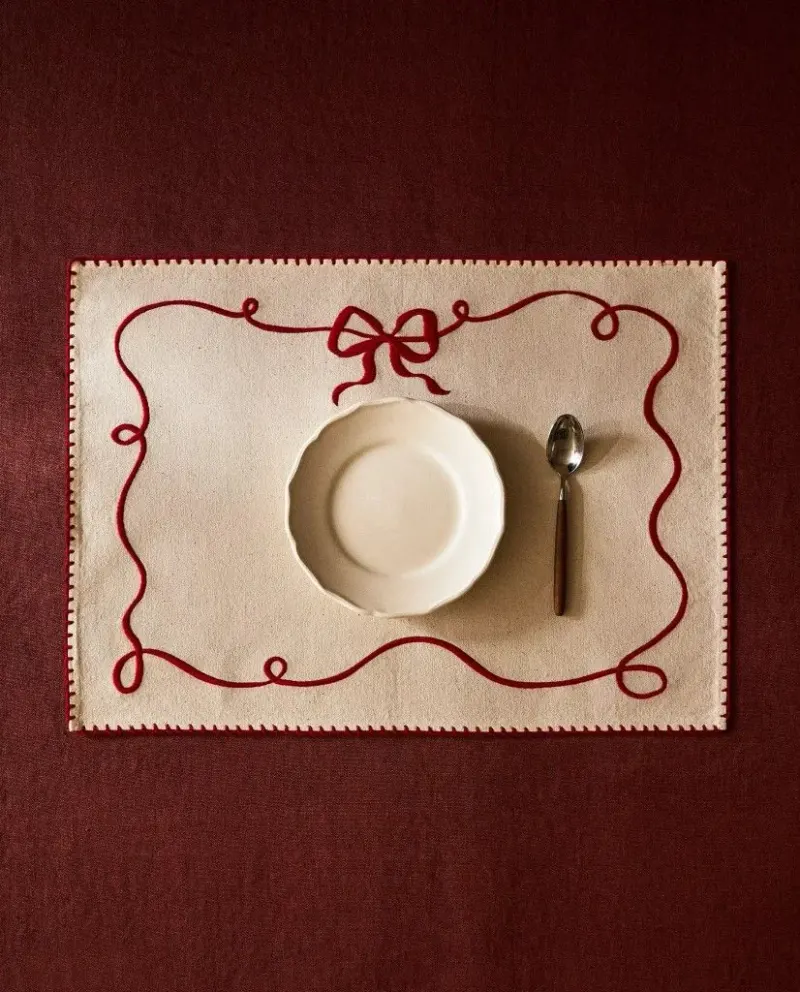
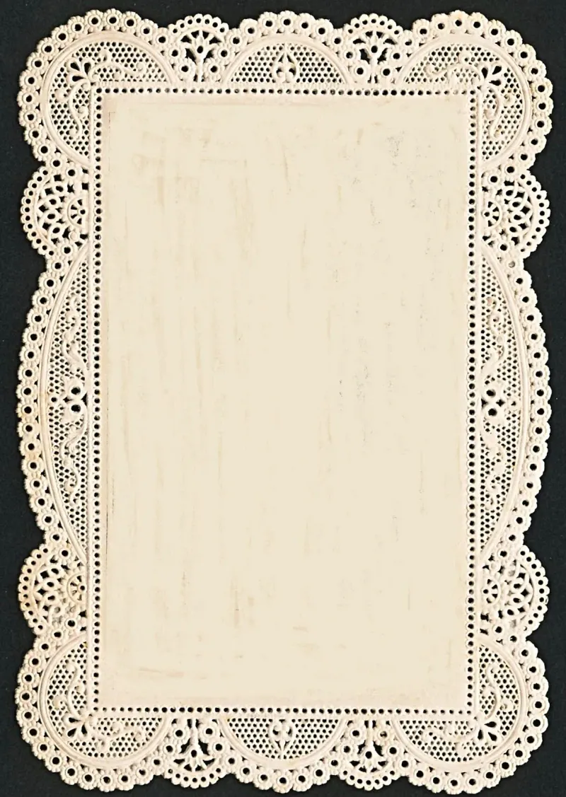
Before drawing anything, I started from what Juliette already loves and already photographs: flowered tablecloths and lace, pink teacups, waxed wood, hunted-down silverware, the tiny gilded frames she collects. Her colours were already there too, in daring pairs: bottle green with pale pink, butter yellow with lilac. The old logo, Les Petites Cuillères de Juliette, was the starting point: delicate, but too small for everything she now does. Then I gathered three boards of references: colours, letters and logos, textures.
- Flowered tablecloths, lace, embroidery
- Hunted-down silverware
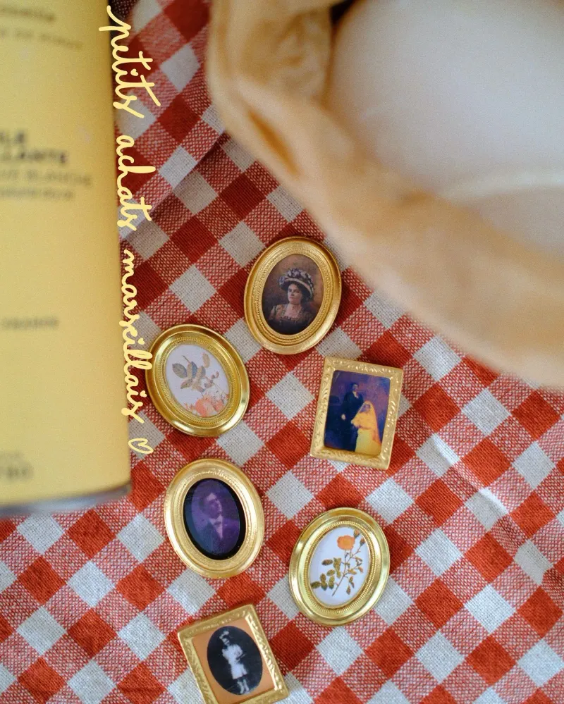
- Tiny gilded frames
- Wax seals, certificates of authenticity
- Houses named after their founder
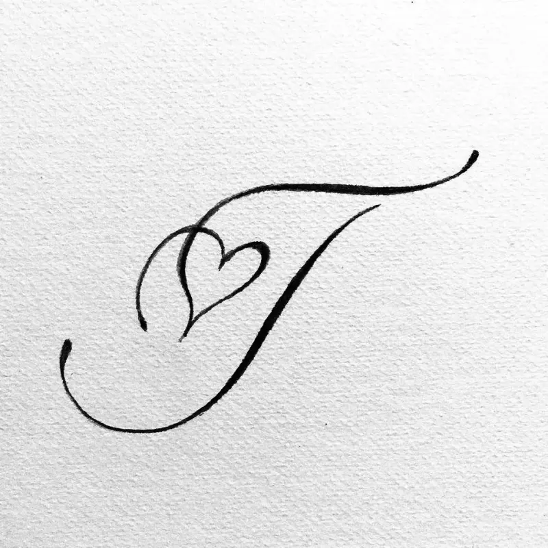
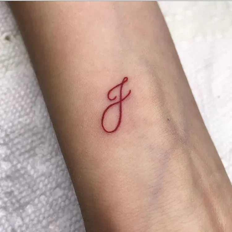
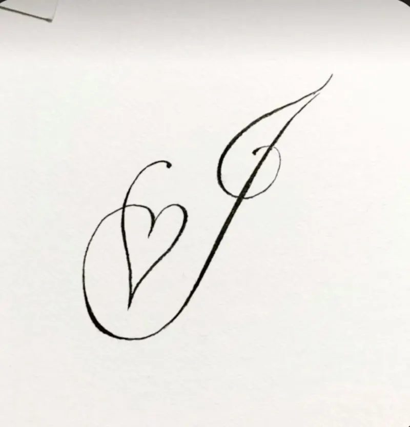
- The heart she draws on her j's
- Bottle green × pale pink, butter yellow × lilac
(Her world)
(Colours)
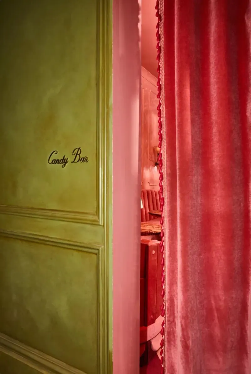
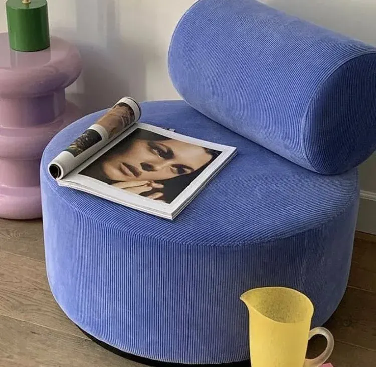
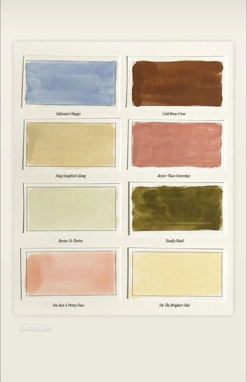
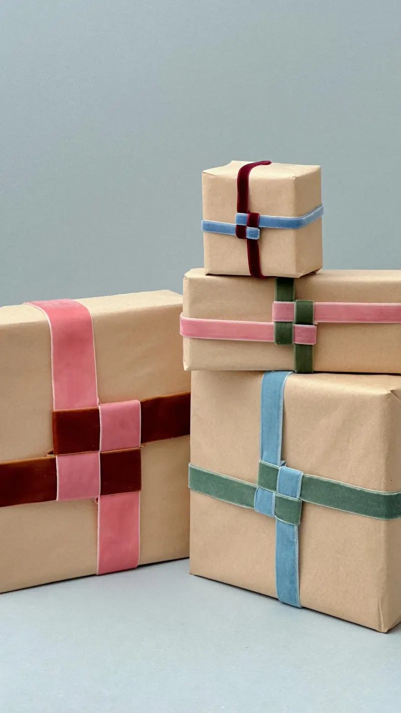
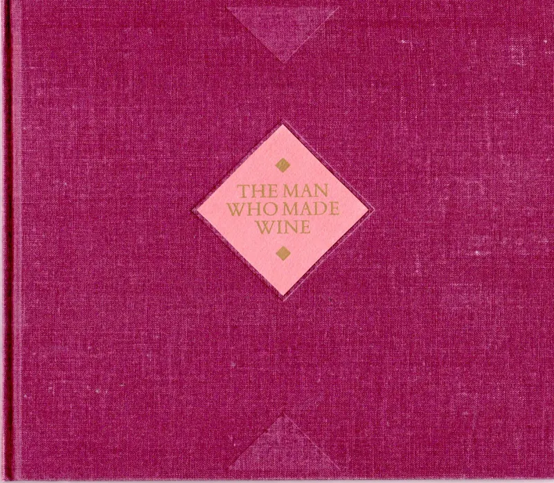
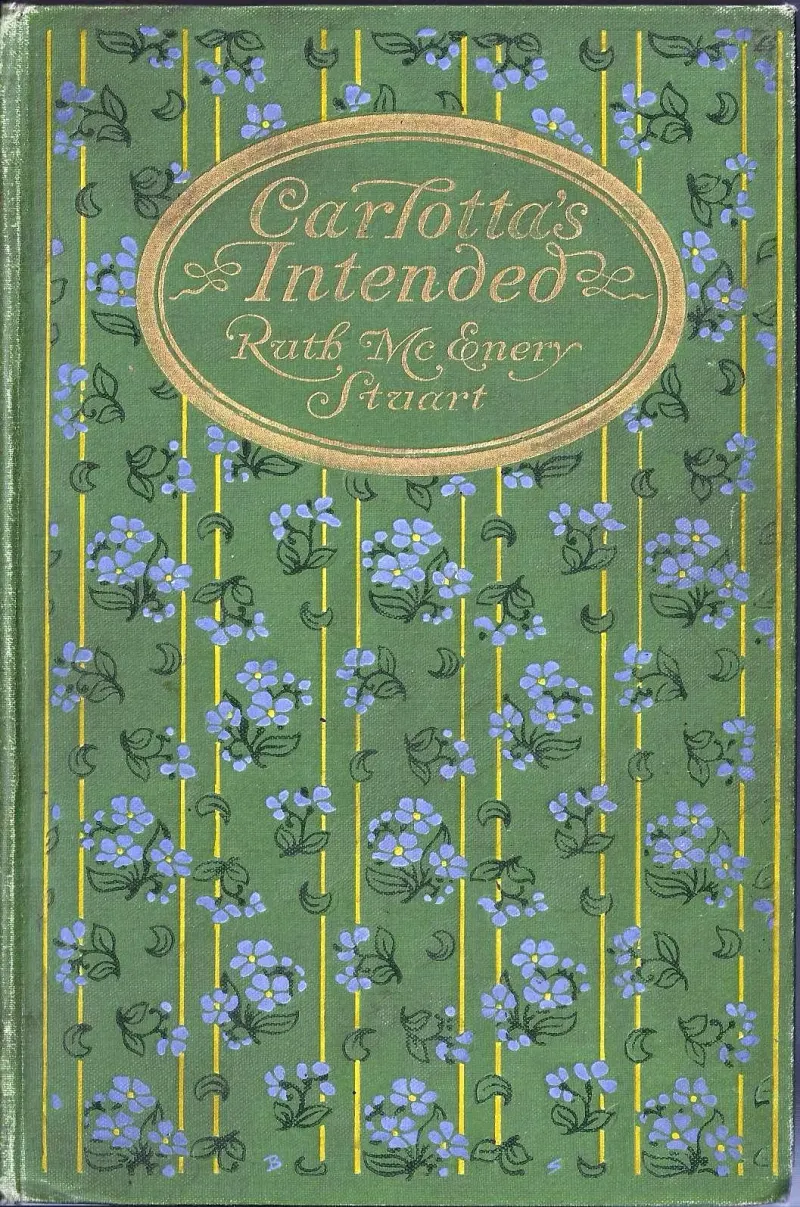
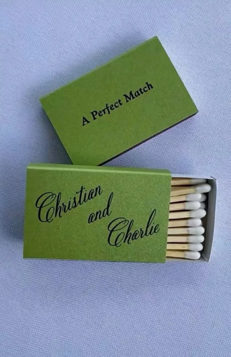
(Logo & type)
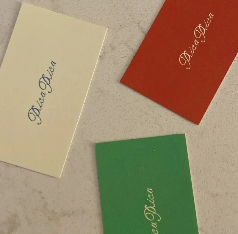
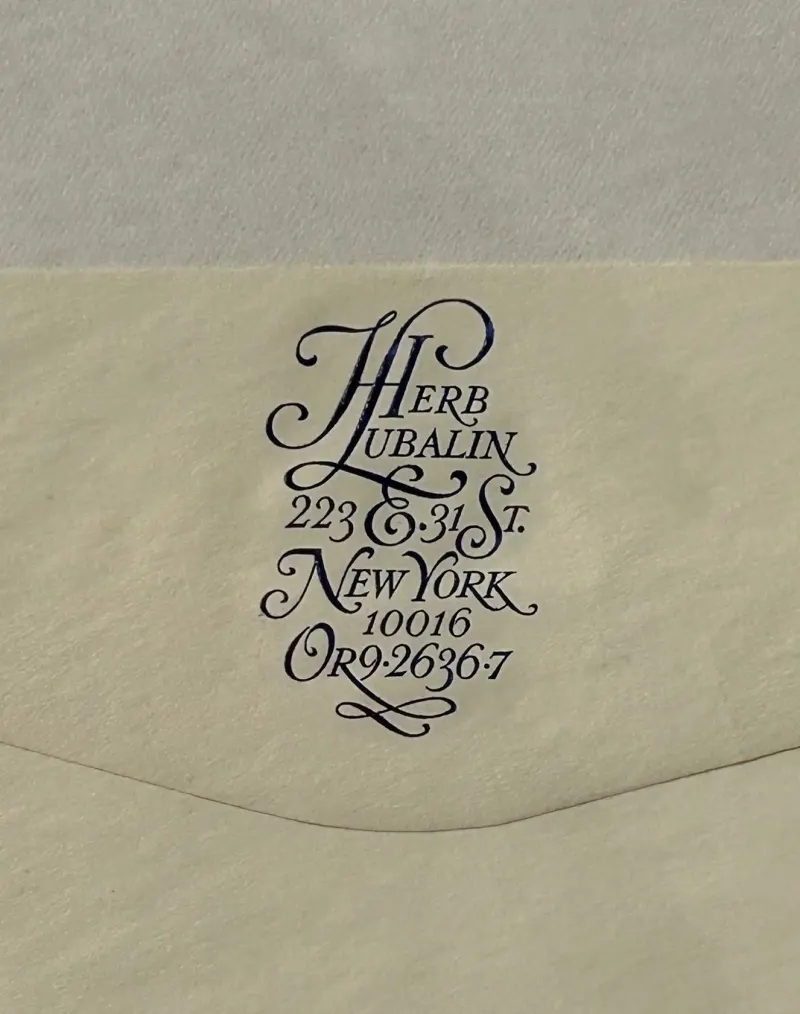
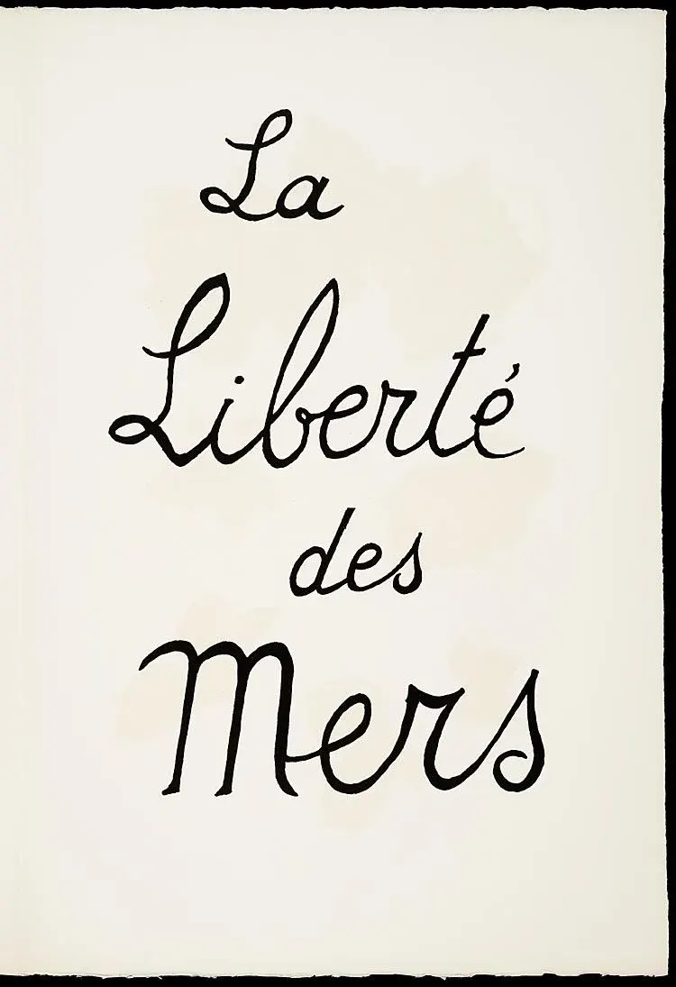
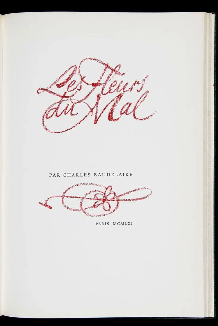
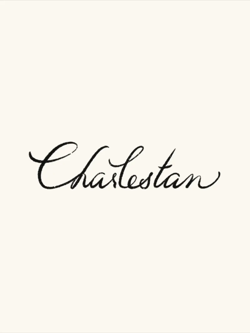
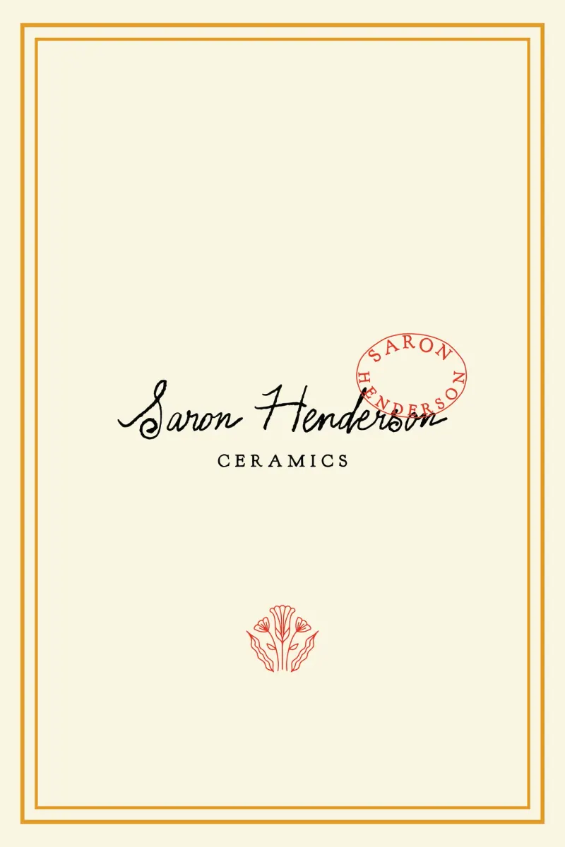
(Textures)
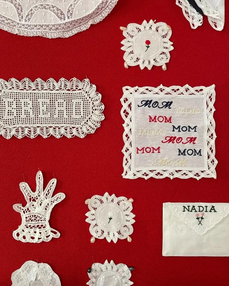
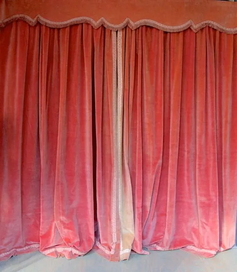
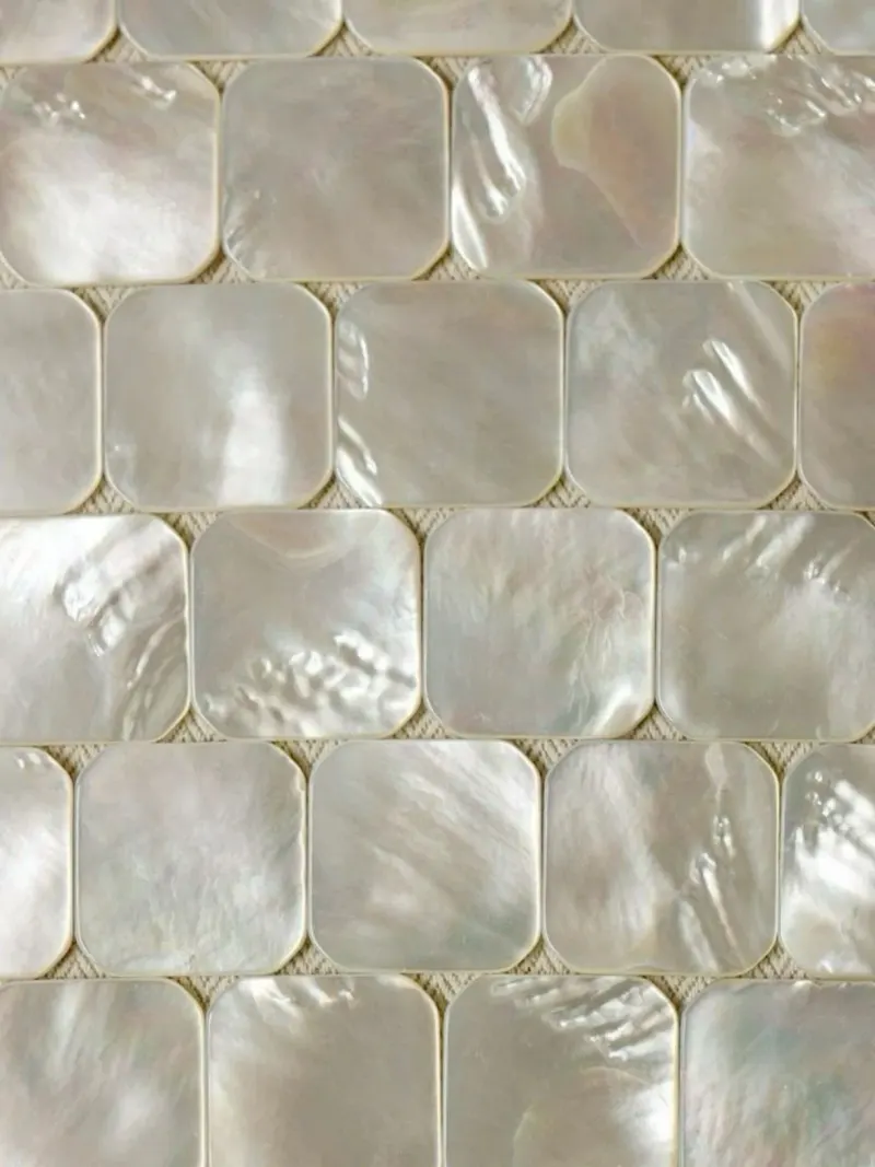
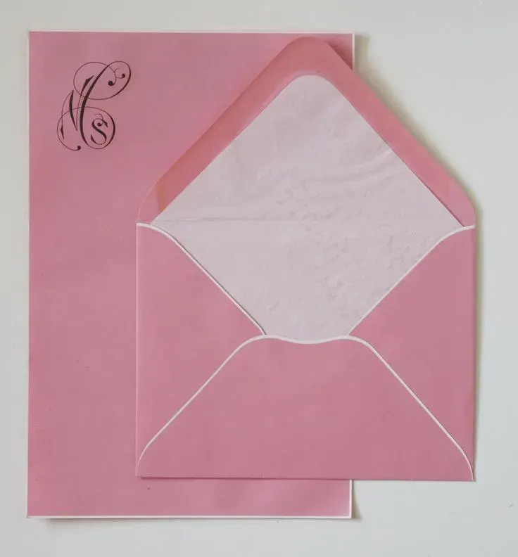
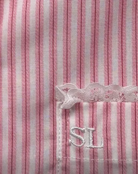
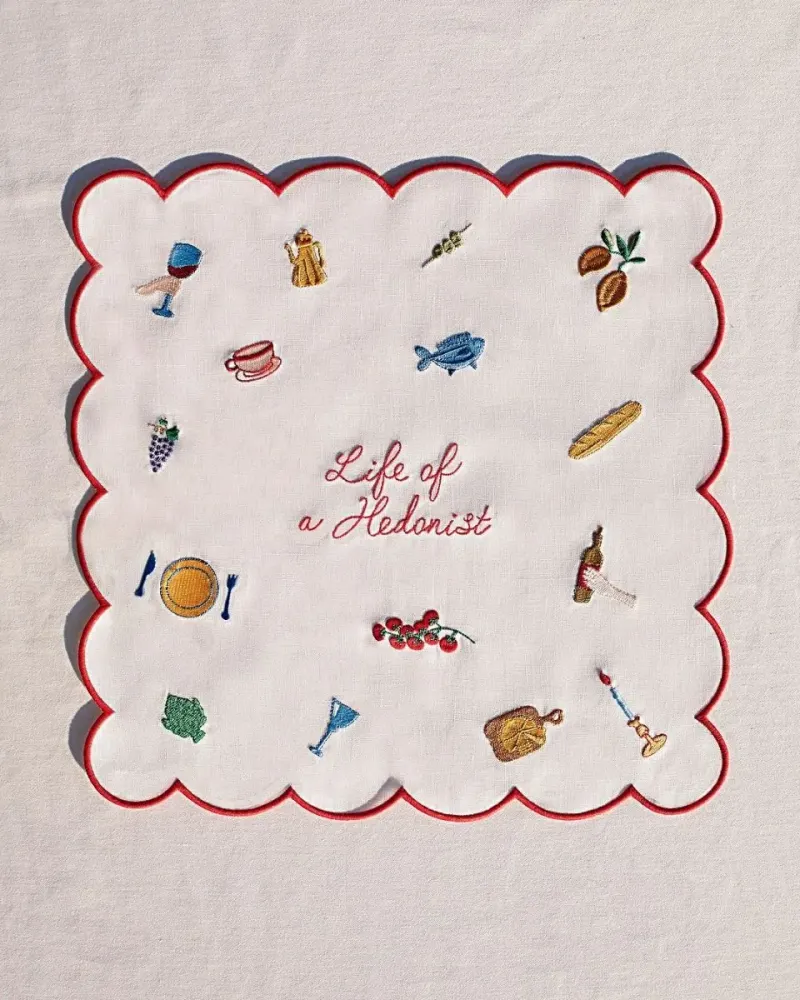
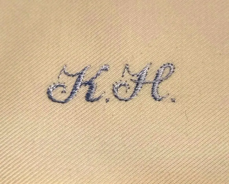
(02)
Reflection
01
Intention
Juliette Brieau stands where two worlds meet: sensitive craftsmanship, and a personal brand in full growth. Juliette does not only sell objects, she tells stories through them, so the identity had to be a setting for those stories, where each piece, engraved, sewn, thrown or found, finds its place. The challenge: a universe recognisable at first glance, soft, tangy and assertive, able to grow with her.
02
A signature
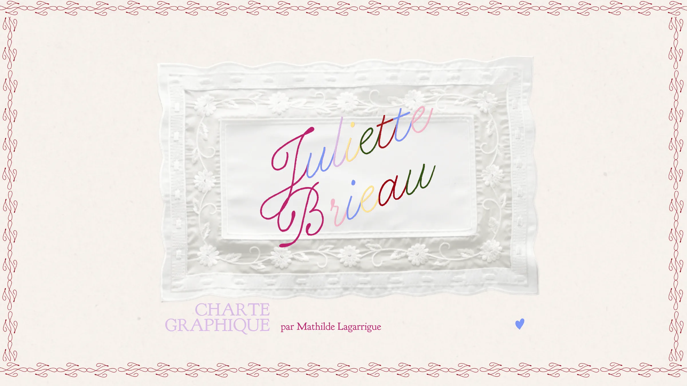
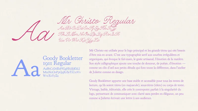
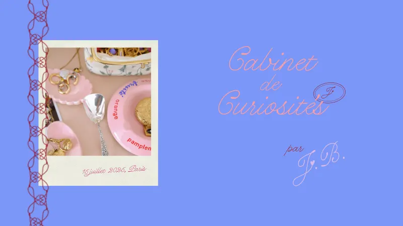
The logotype is set in Mr Christo, a calligraphic serif, structured and organic at once. Its deliberately imperfect stroke recalls the hand. Like a signature, it presents Juliette as the artist-curator she is, the way other founders open houses under their own name.
03
The J and the heart
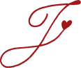
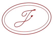
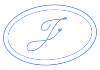
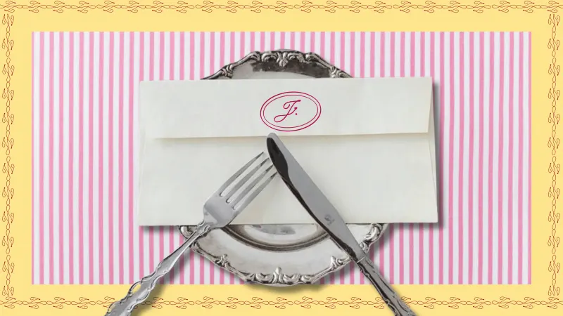
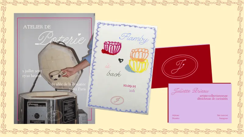
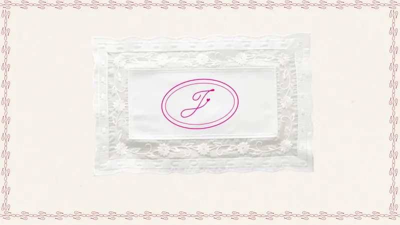
The heart is the symbol Juliette uses most: it adorns the j's she writes, it is tattooed on her wrist. Written by hand in ink, it becomes the monogram. Her initials then gather into a seal, like sealing wax or a stamp of authenticity: this find went through Juliette's expert hands. Its frame comes from the miniature gilded frames she collects, and it is deliberately not quite level, because what makes handmade perfect is precisely its slight imperfection.
04
Two typographic voices
Mr Christo for the logo and the big titles: the gesture, the emotion of the material. Goudy Bookletter 1911 for everything to be read: vintage, legible, editorial, the counterpoint that lets her speak clearly without losing elegance, a little as if Juliette were writing a letter to her audience.
05
Colour as a pillar
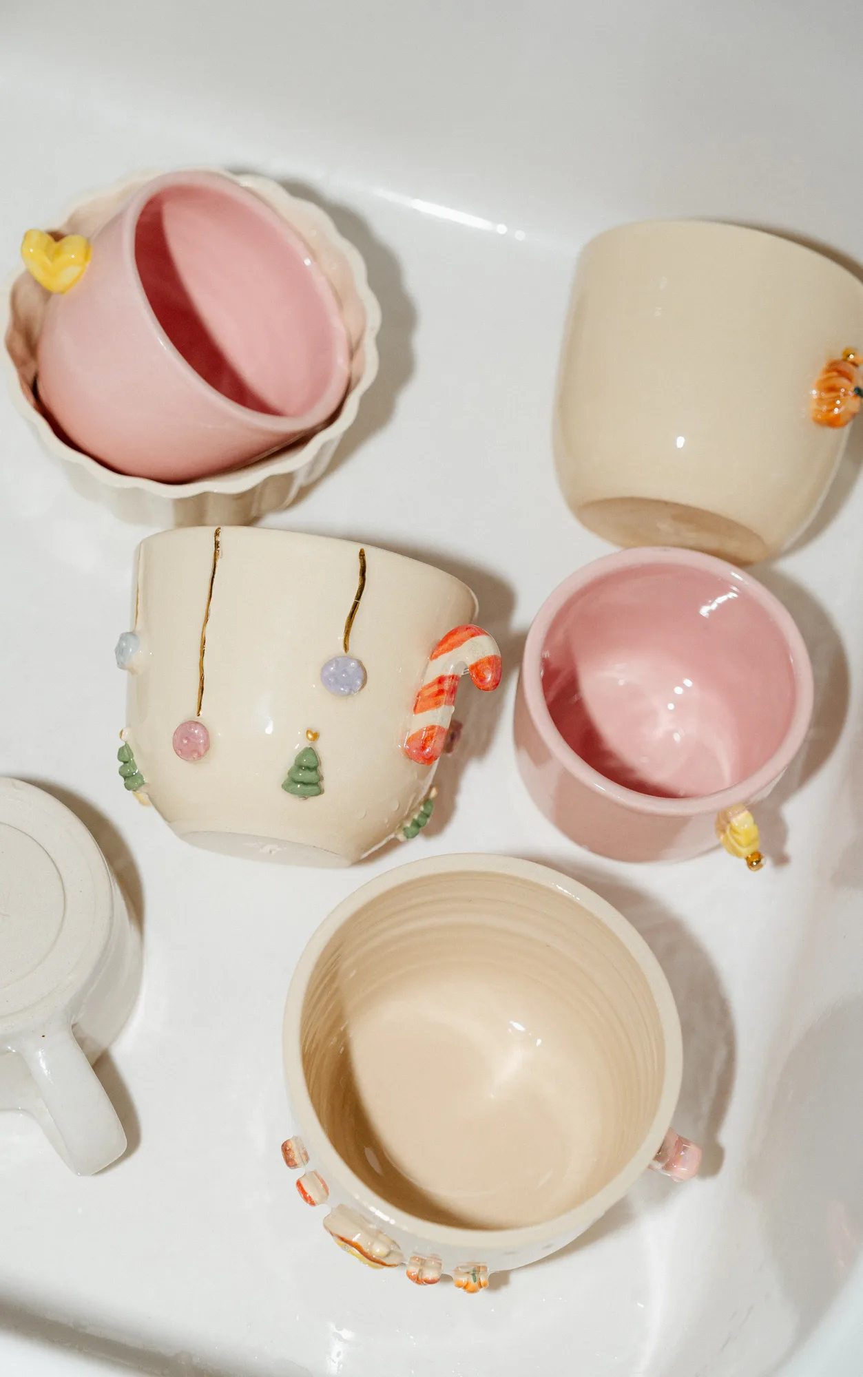
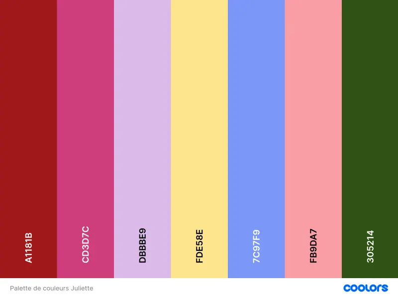
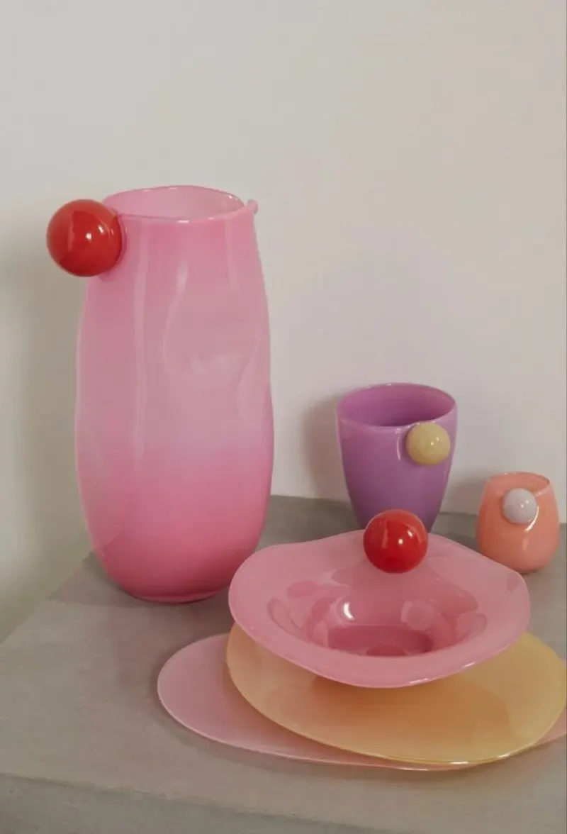
Juliette loves colour and daring combinations. Pastels are no longer the base, pale and dark grey disappear: bright colours become a distinctive pillar, as they are in her home, her wardrobe and the paints on her ceramics. Pastel meets neon; vintage meets modern. Each new collection can lean on one or two secondary shades.
06
Material and gesture
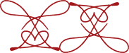
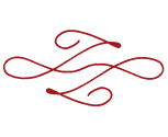
Textures, photographs and the effects of real material (paper, cloth, diffused light) rather than digital patterns; a pattern only appears if it comes from a real object. The graphic elements are drawn by hand, hers or others', then vectorised, and the J becomes a playground: emblem, ornament, page border, a red thread through the whole identity.
(03)
Results
01
Logotype




02
Monogram & seal

03
Palette
- Red#A1181B
- Fuchsia#CD3D7C
- Lilac#DBBBE9
- Butter yellow#FDE58E
- Blue#7C97F9
- Pink#F89DA7
- Bottle green#305214
04
Typefaces
05
Ornaments
06
Applications
07
The website
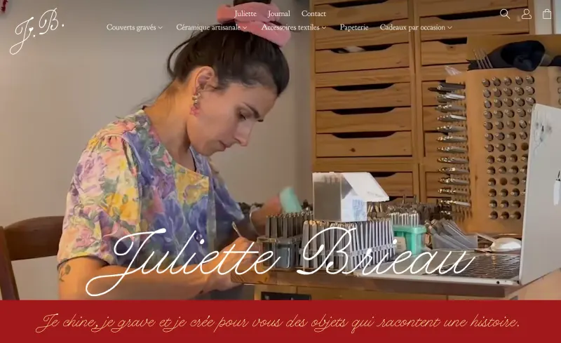
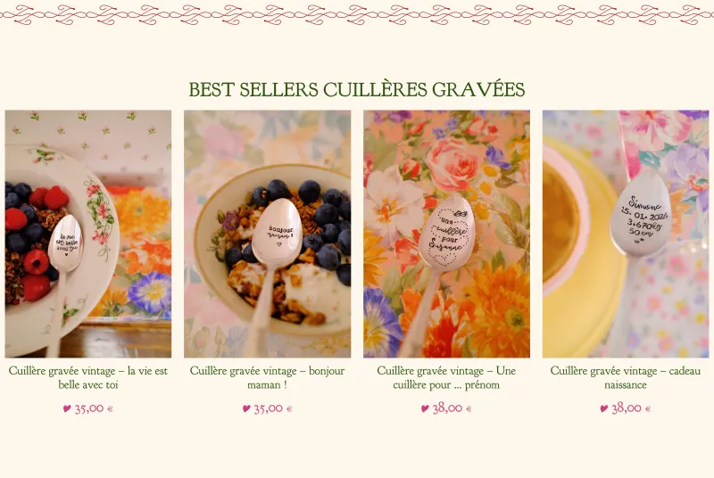
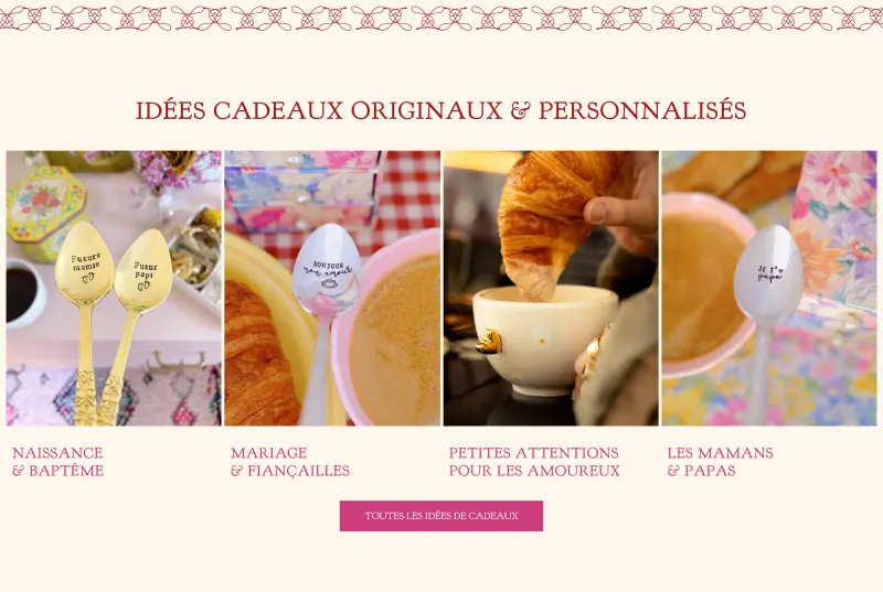
The website, designed and built by Mathilde Langle from the new identity.
08
The brand photoshoot
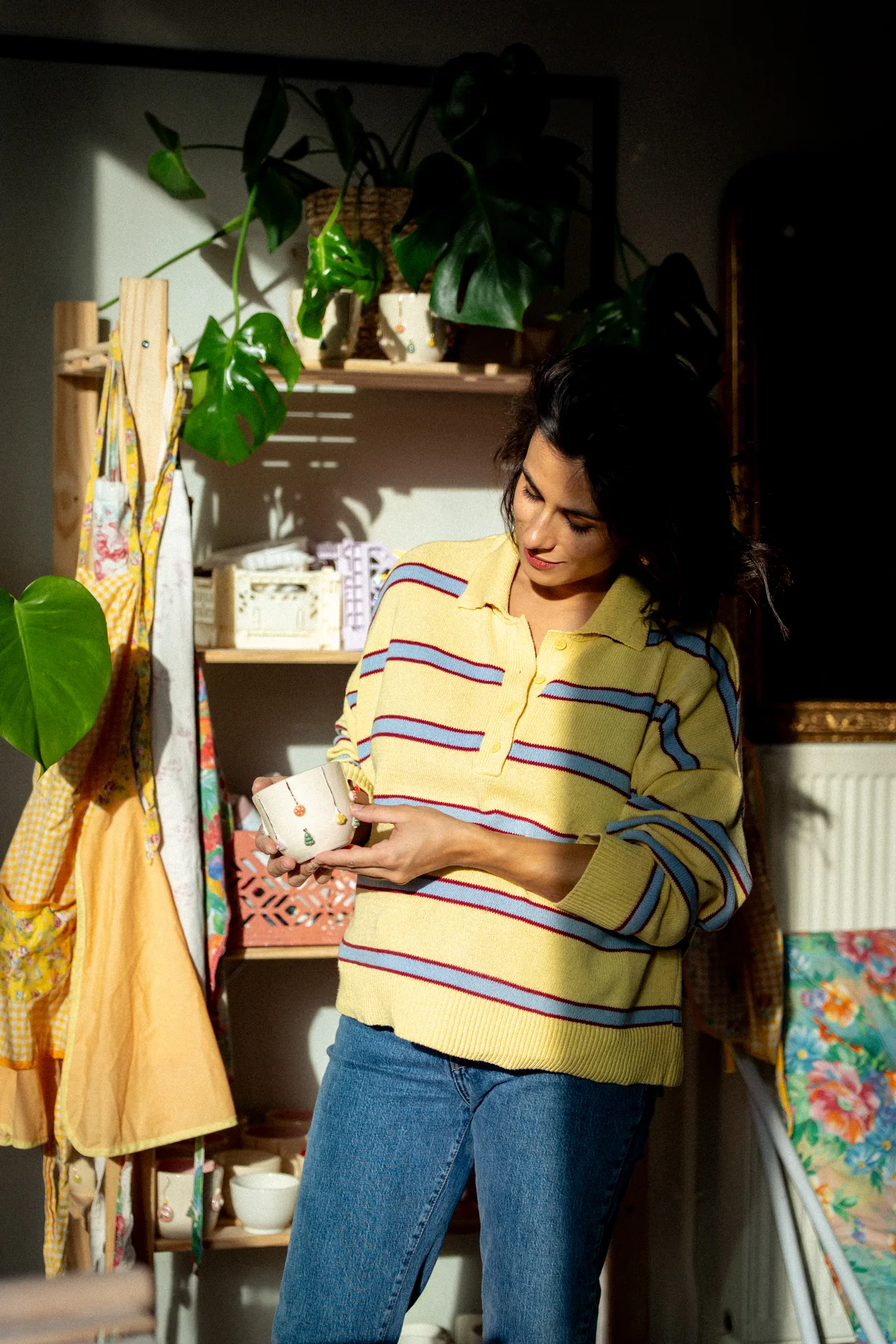
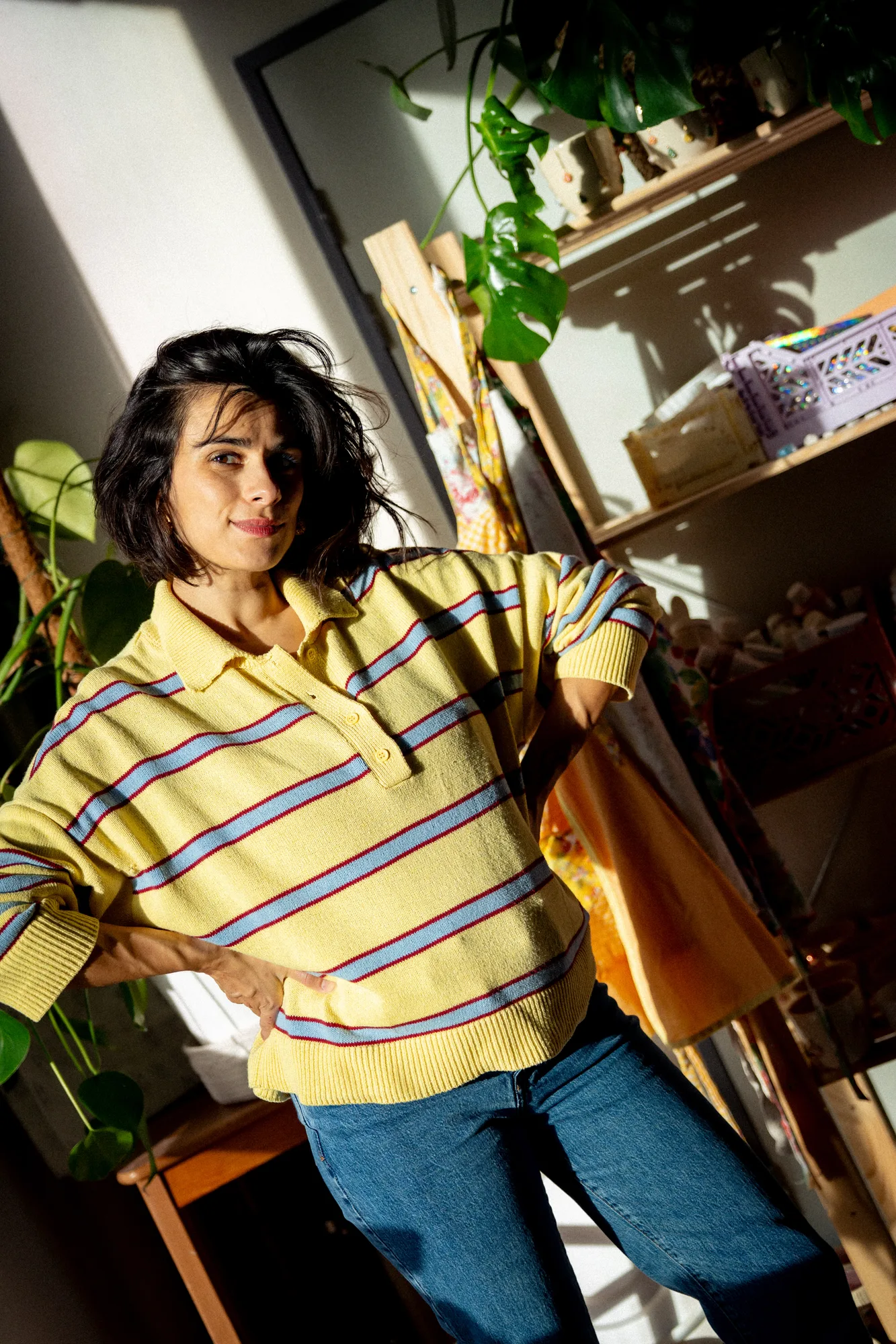
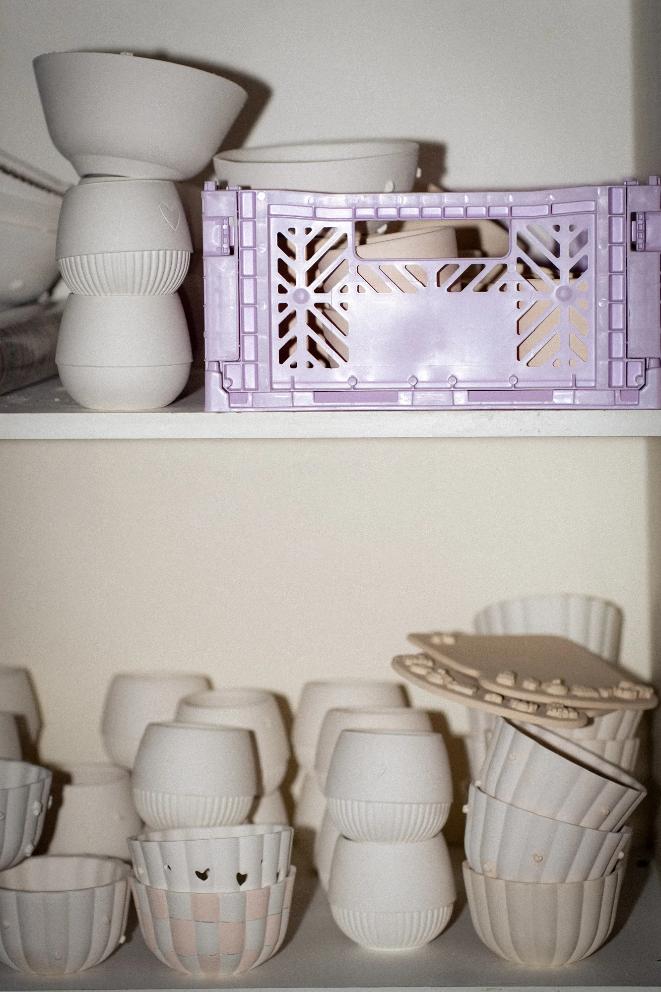
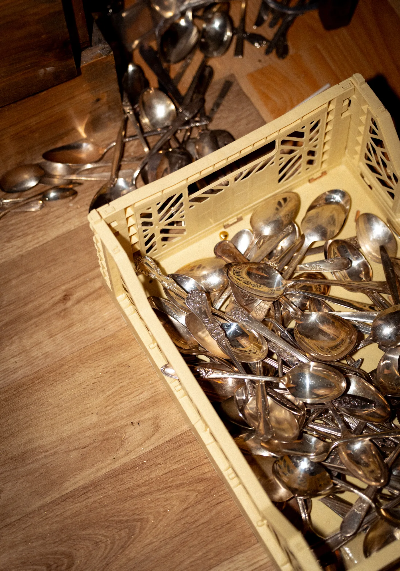
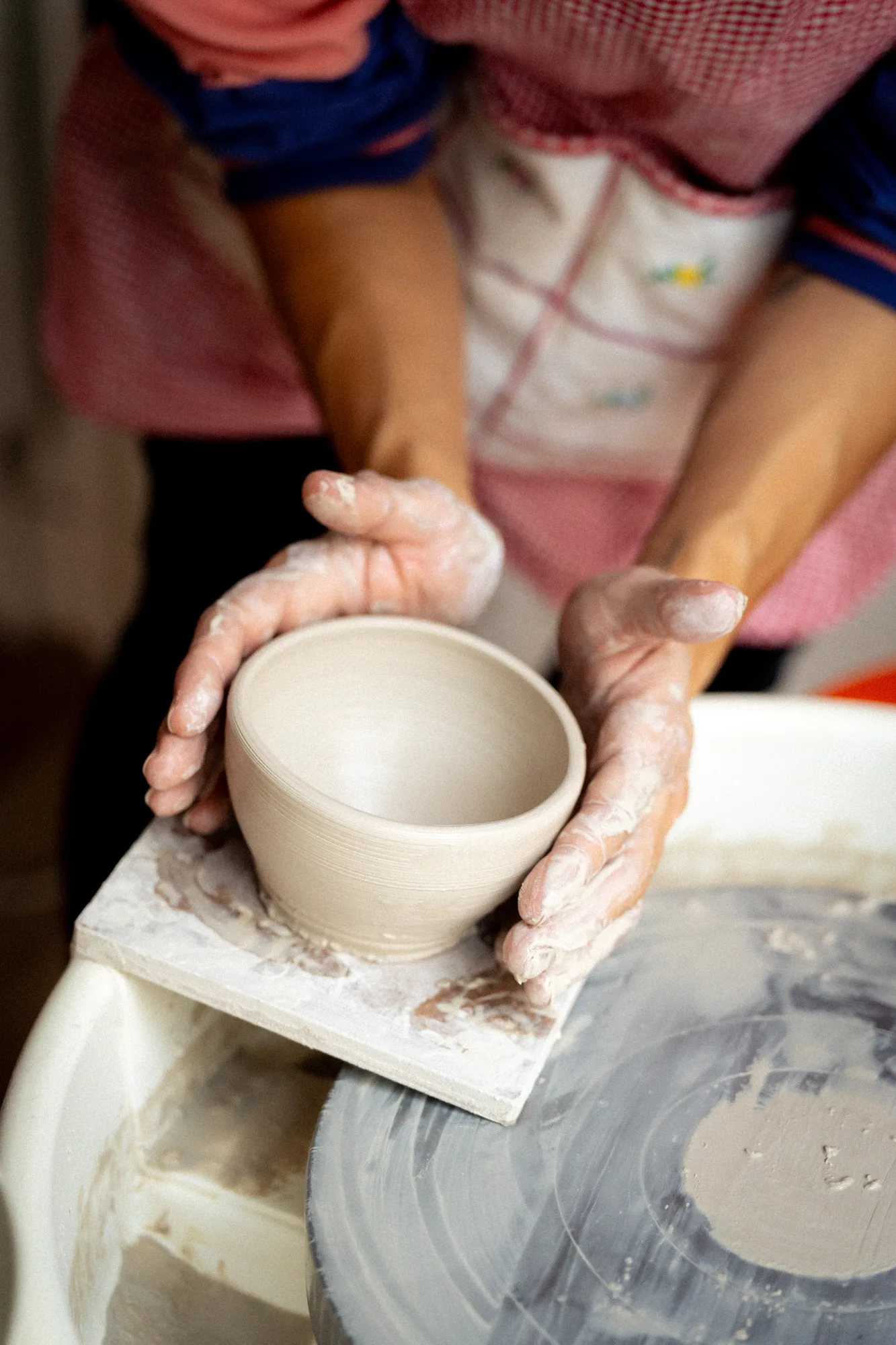
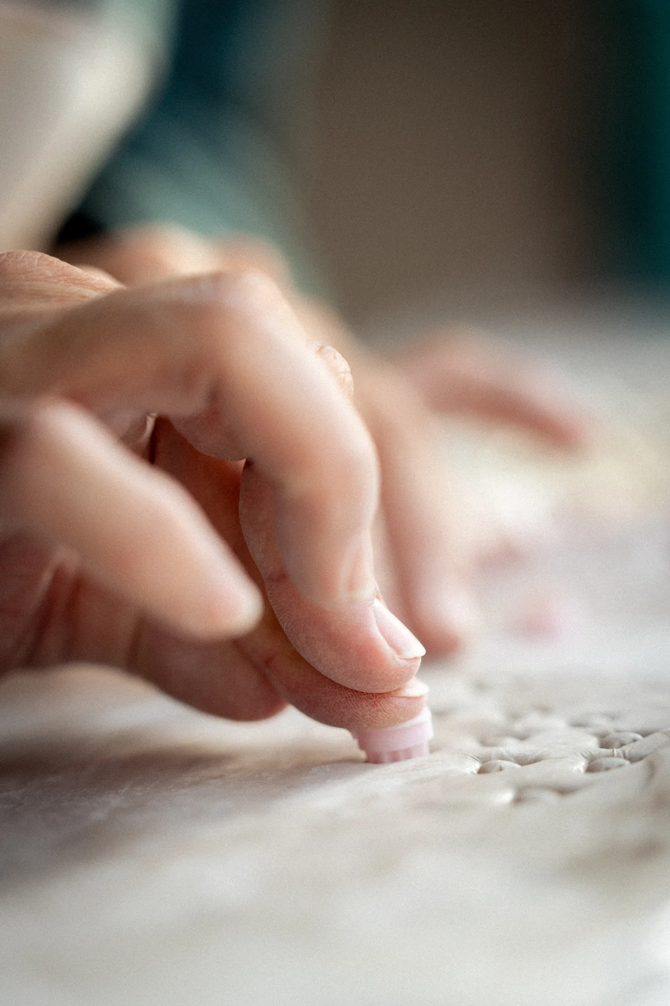
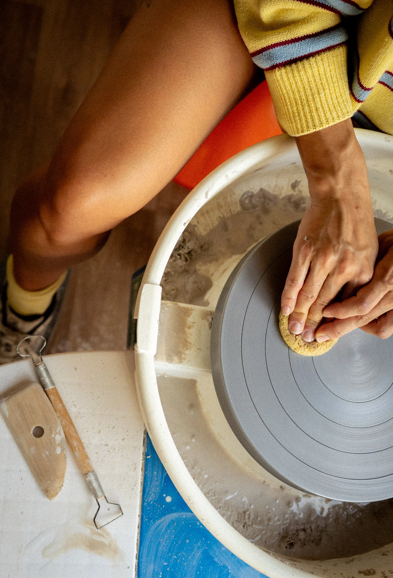
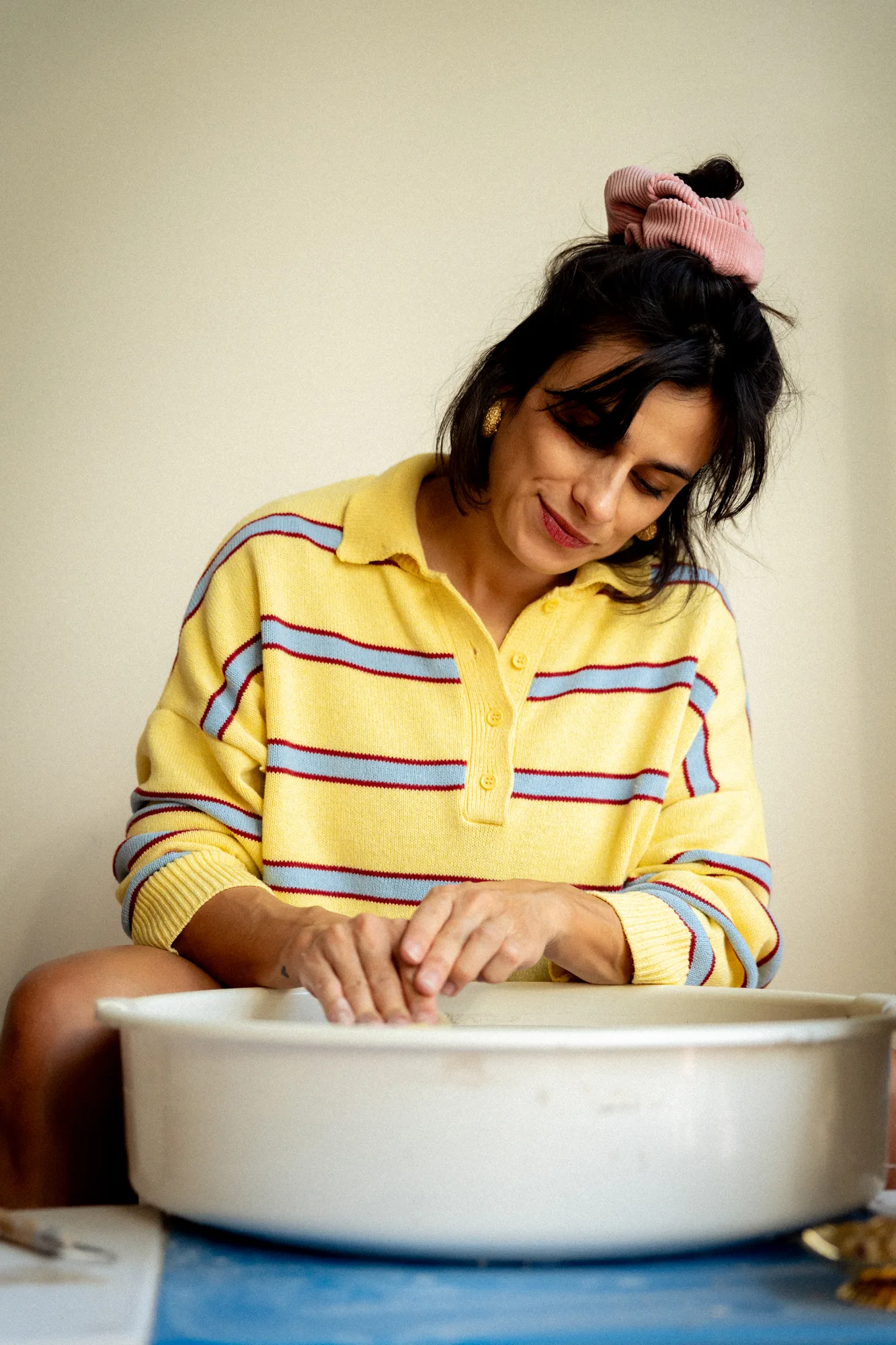
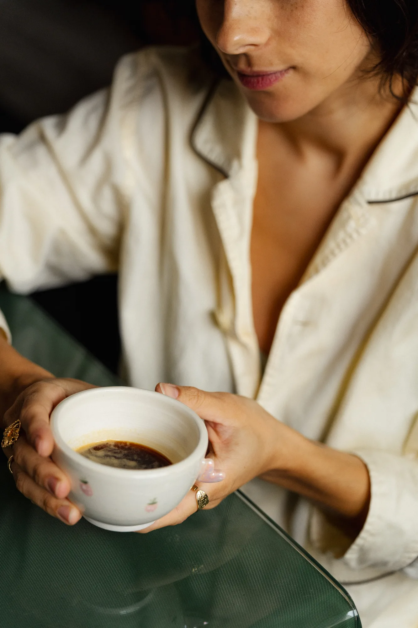
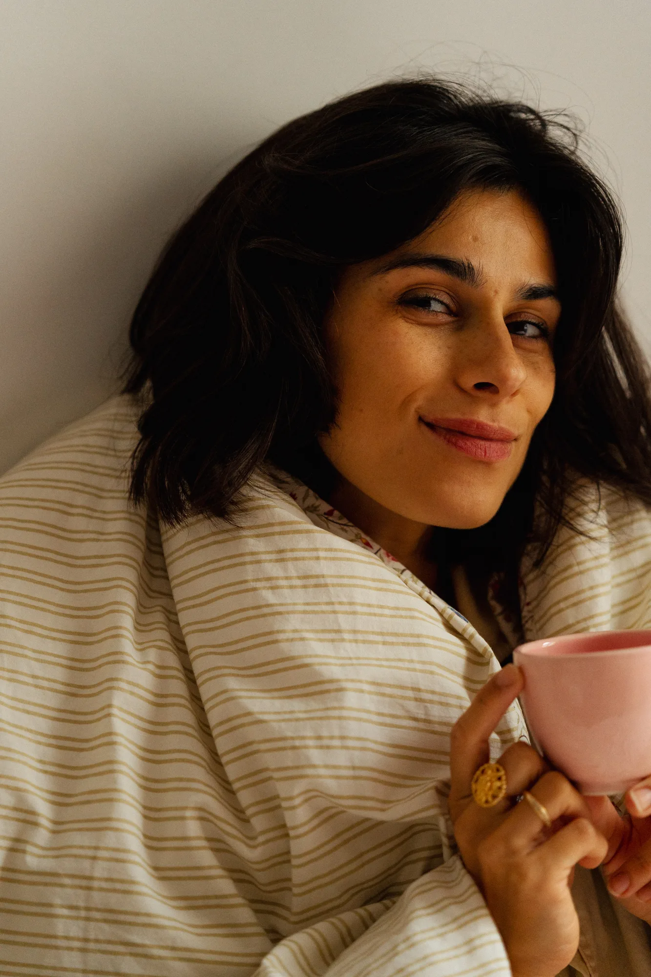
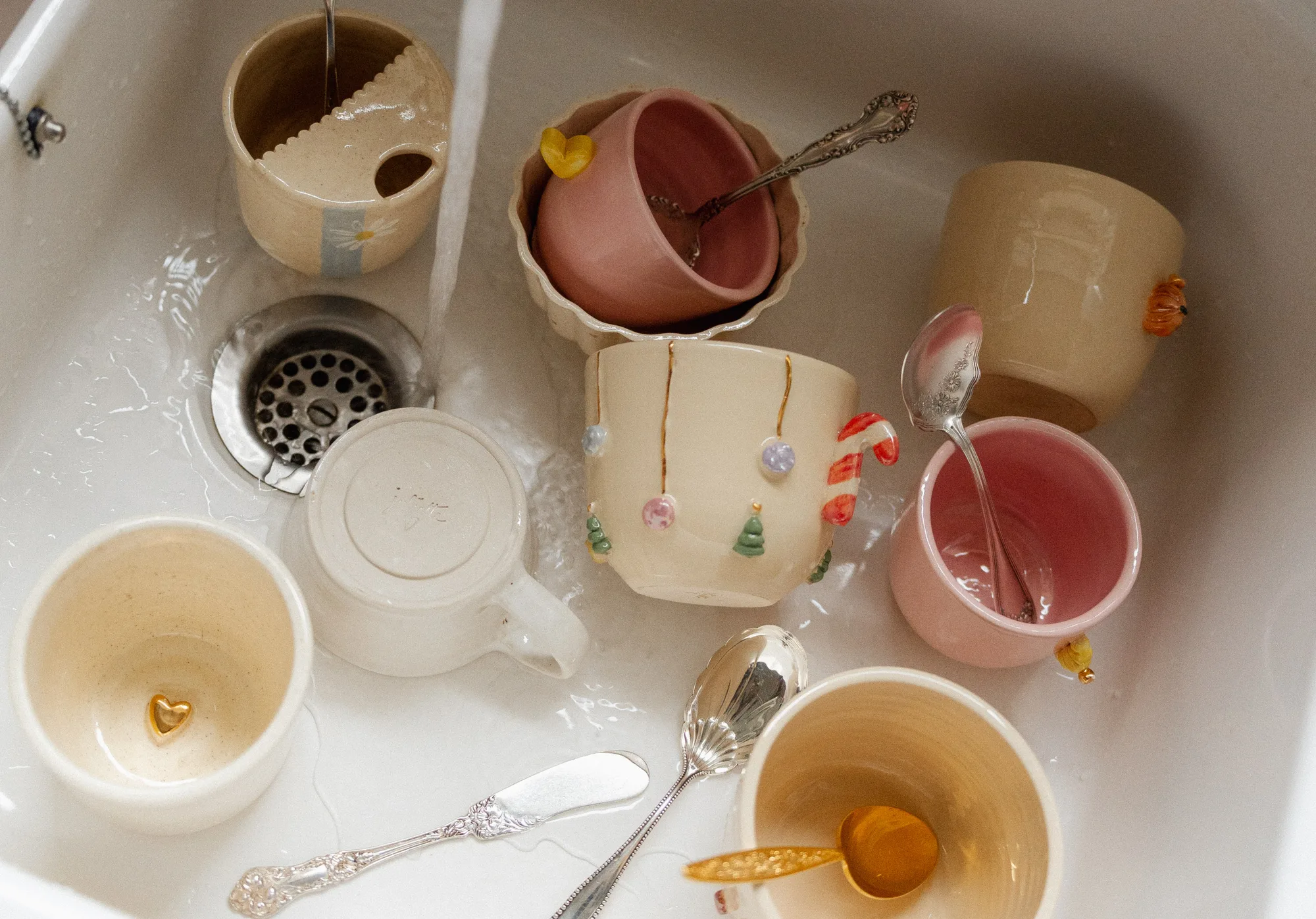
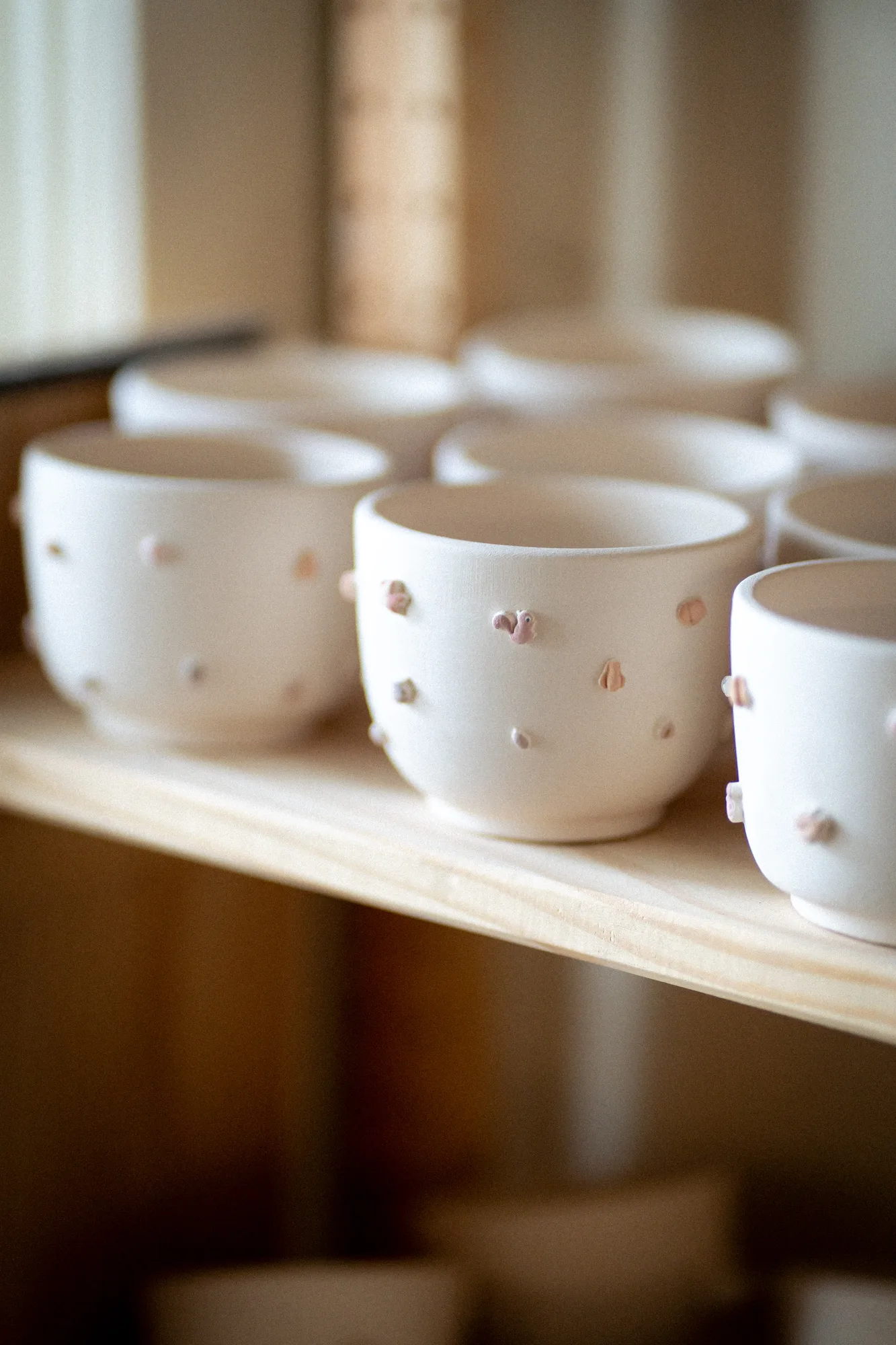
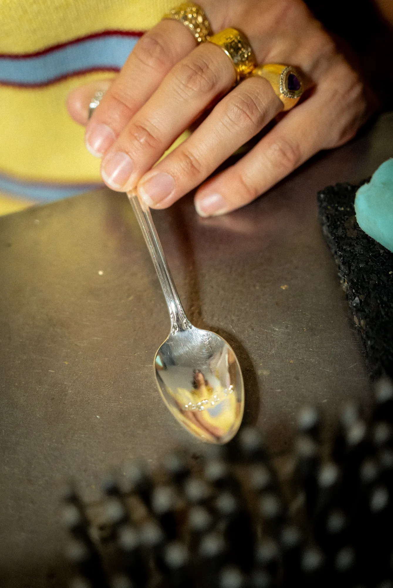
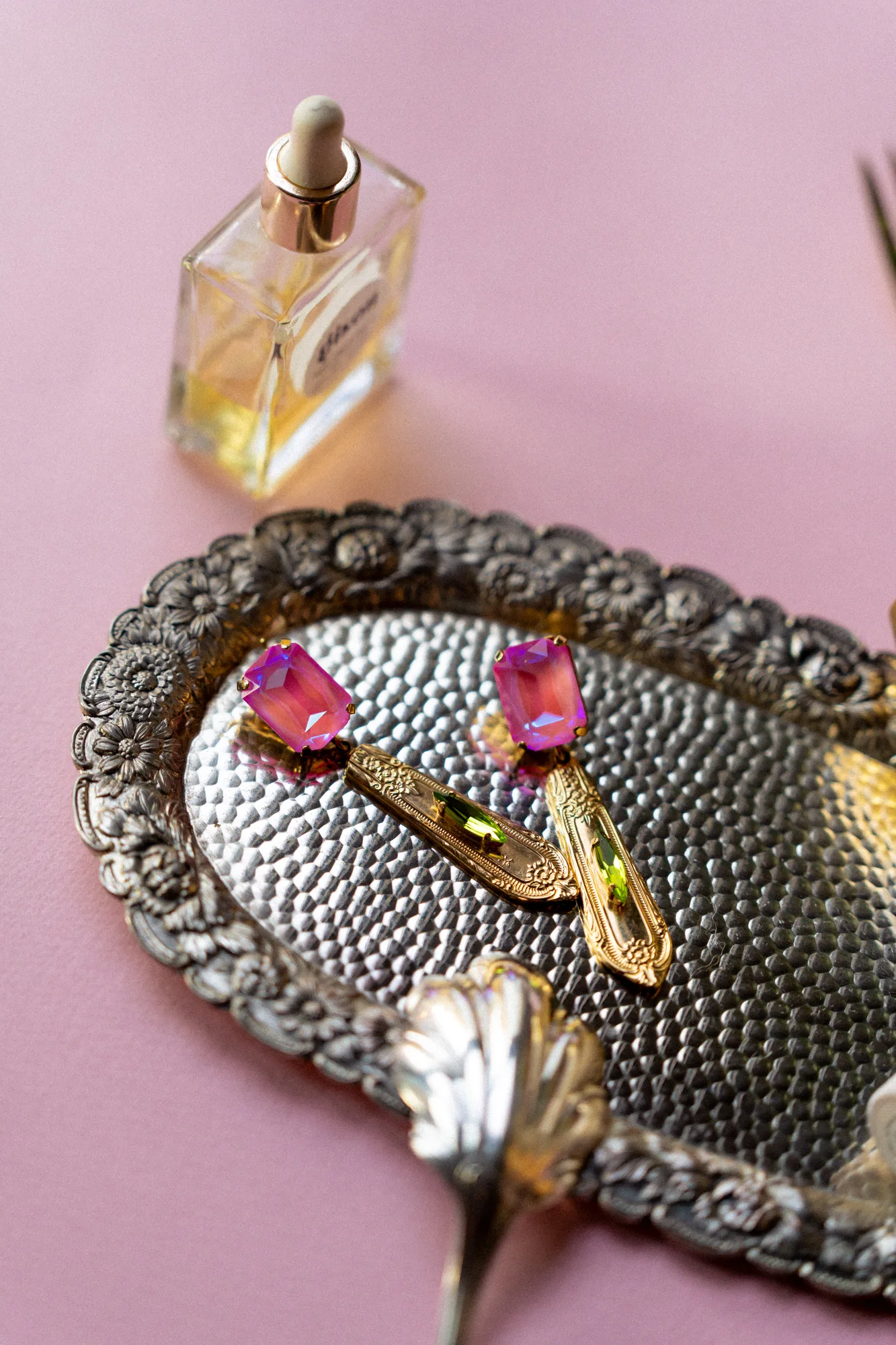
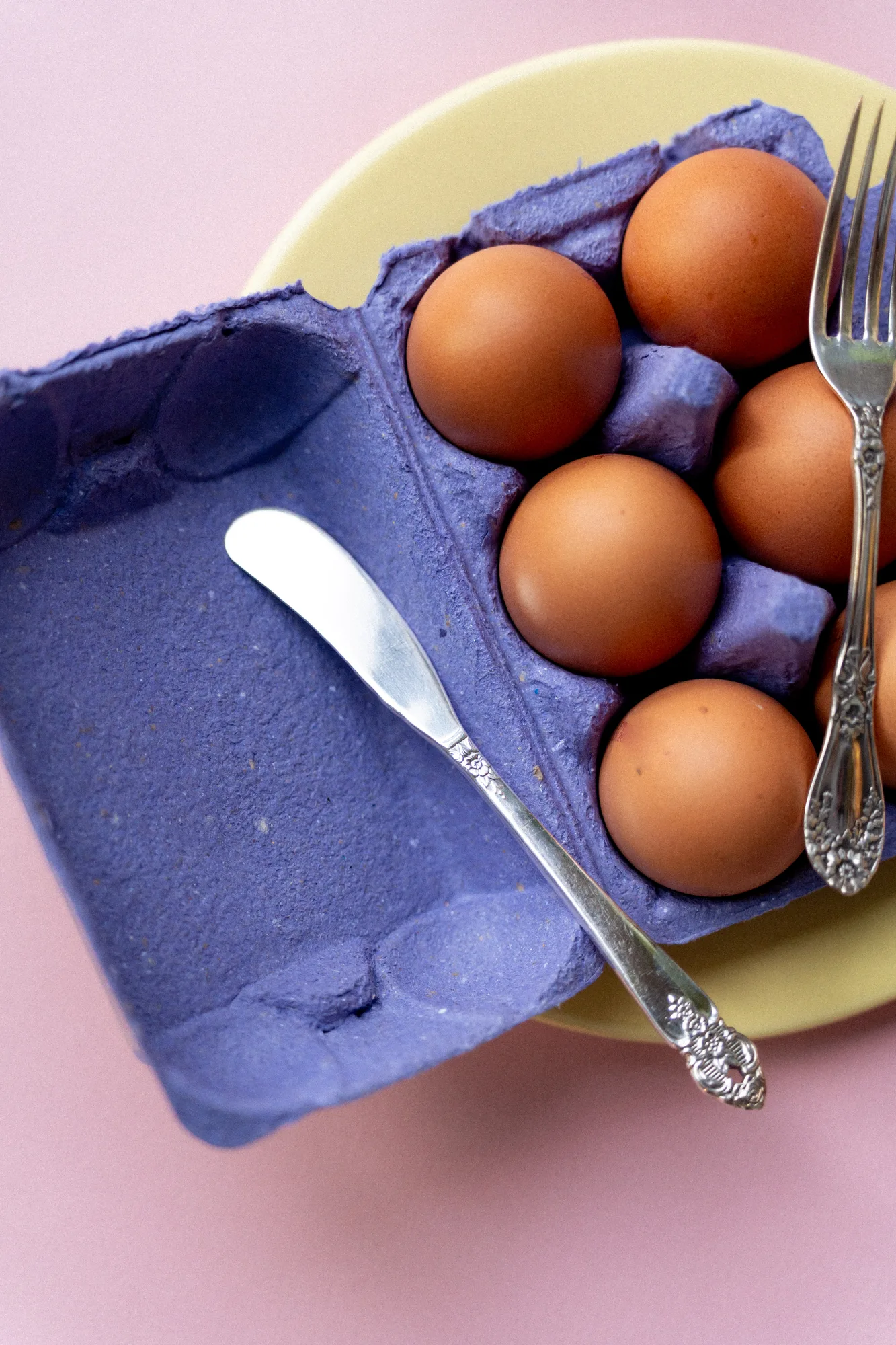
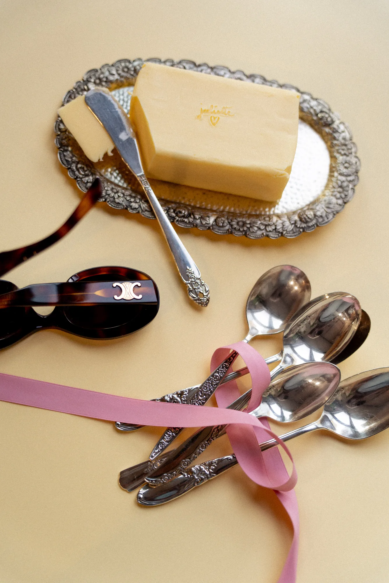
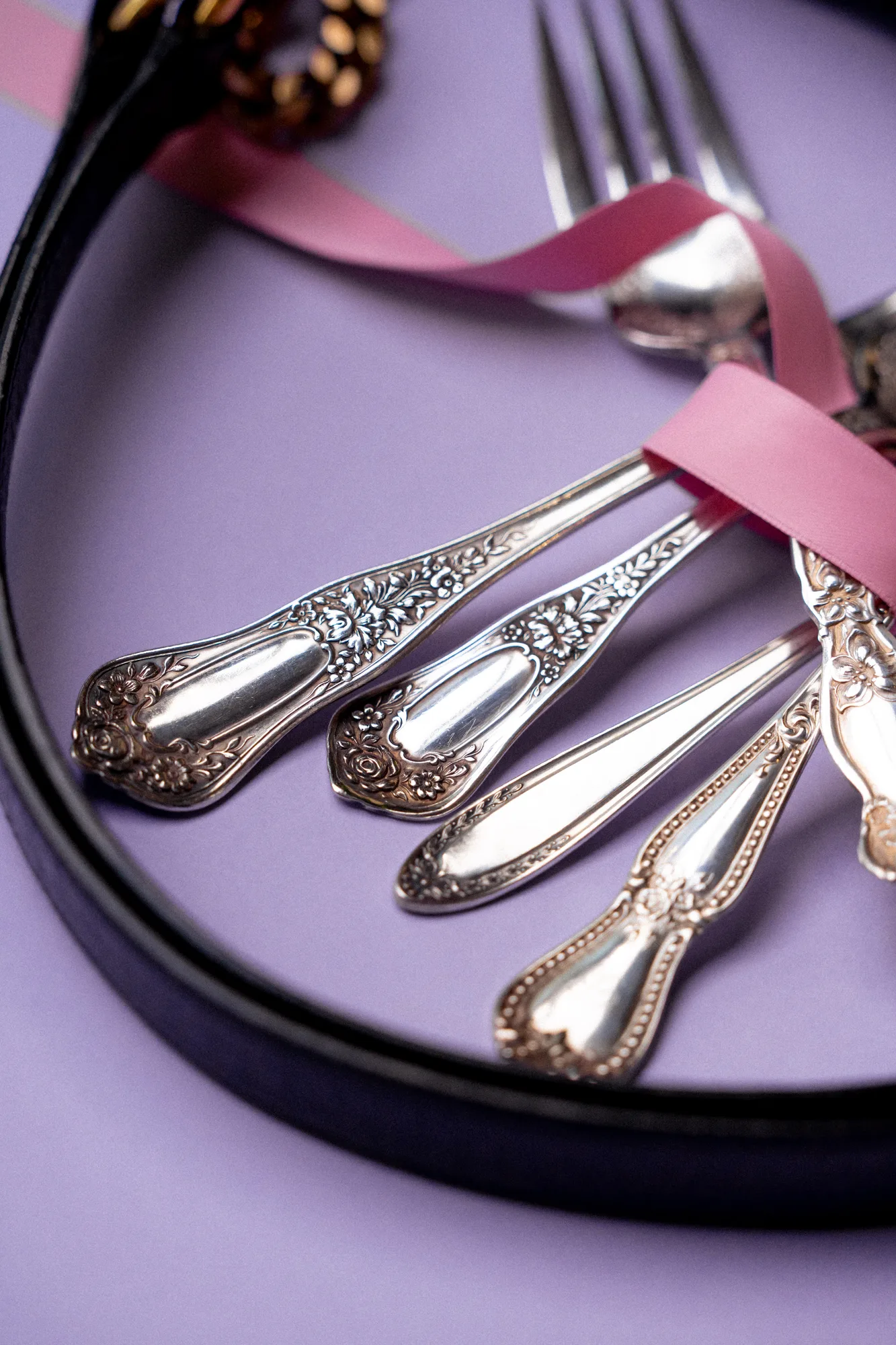
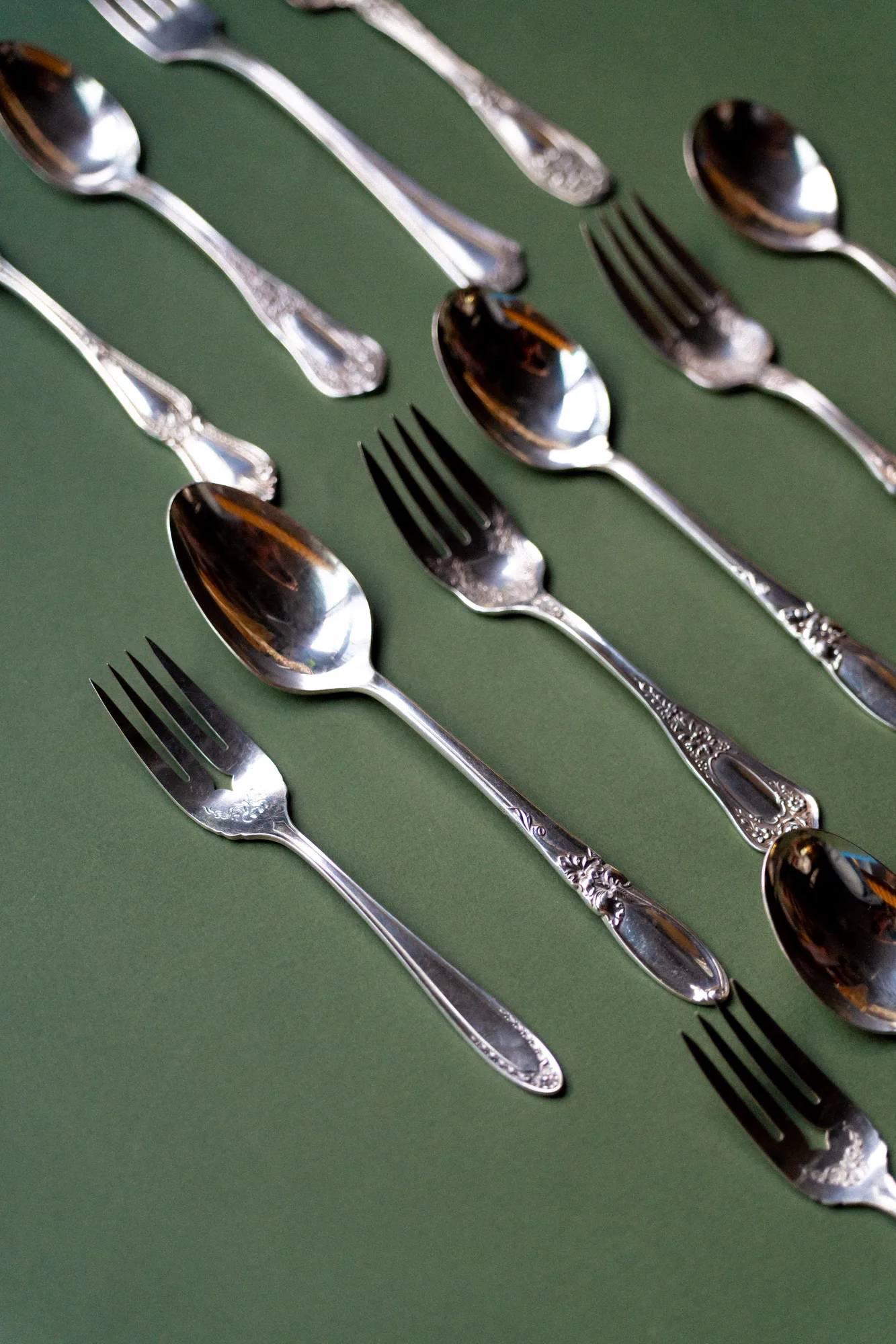
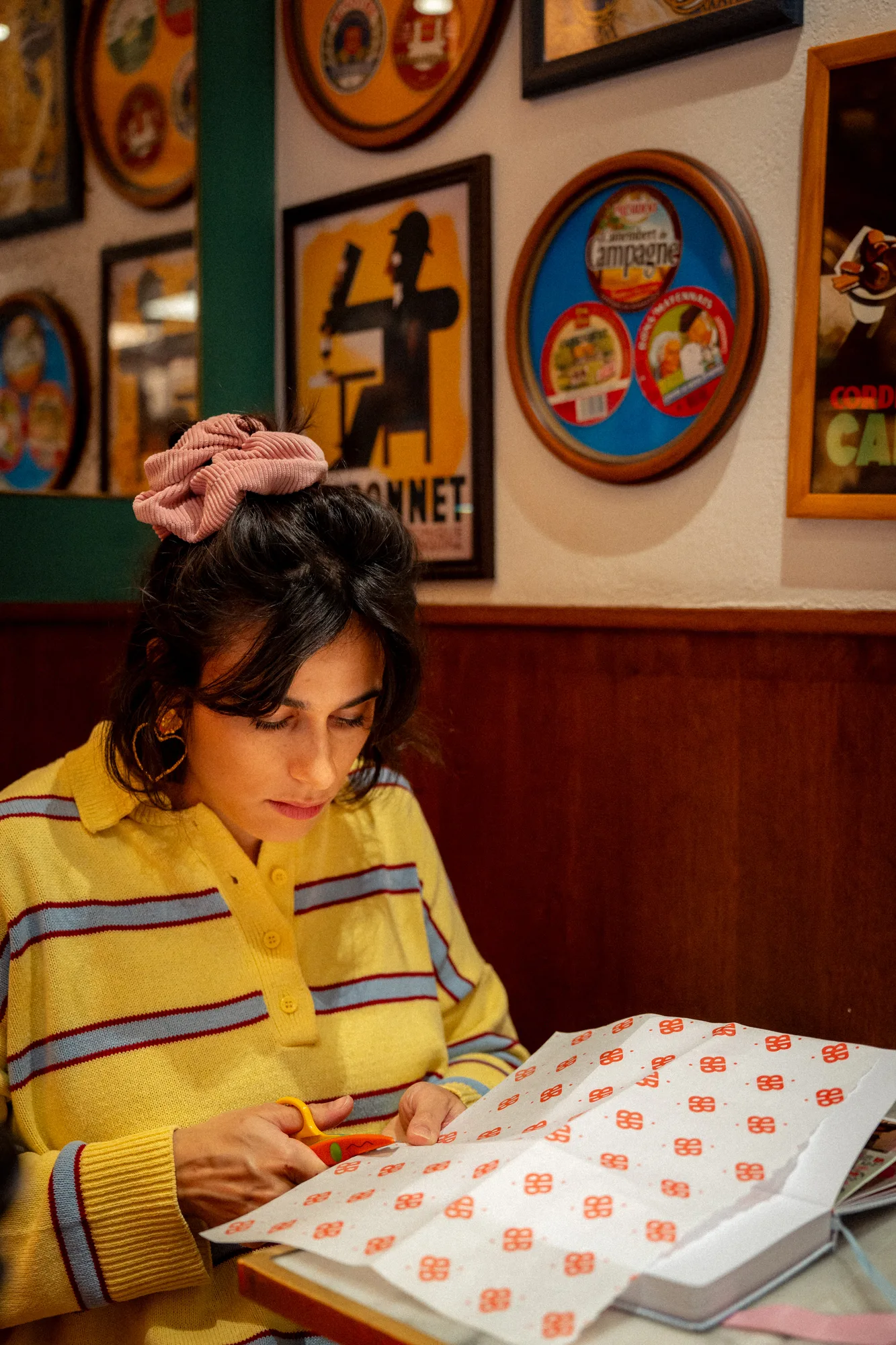
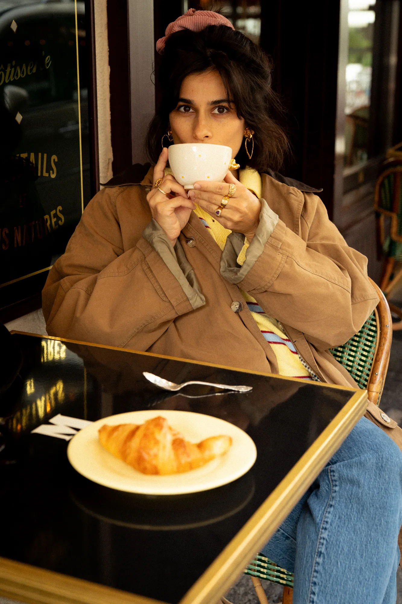
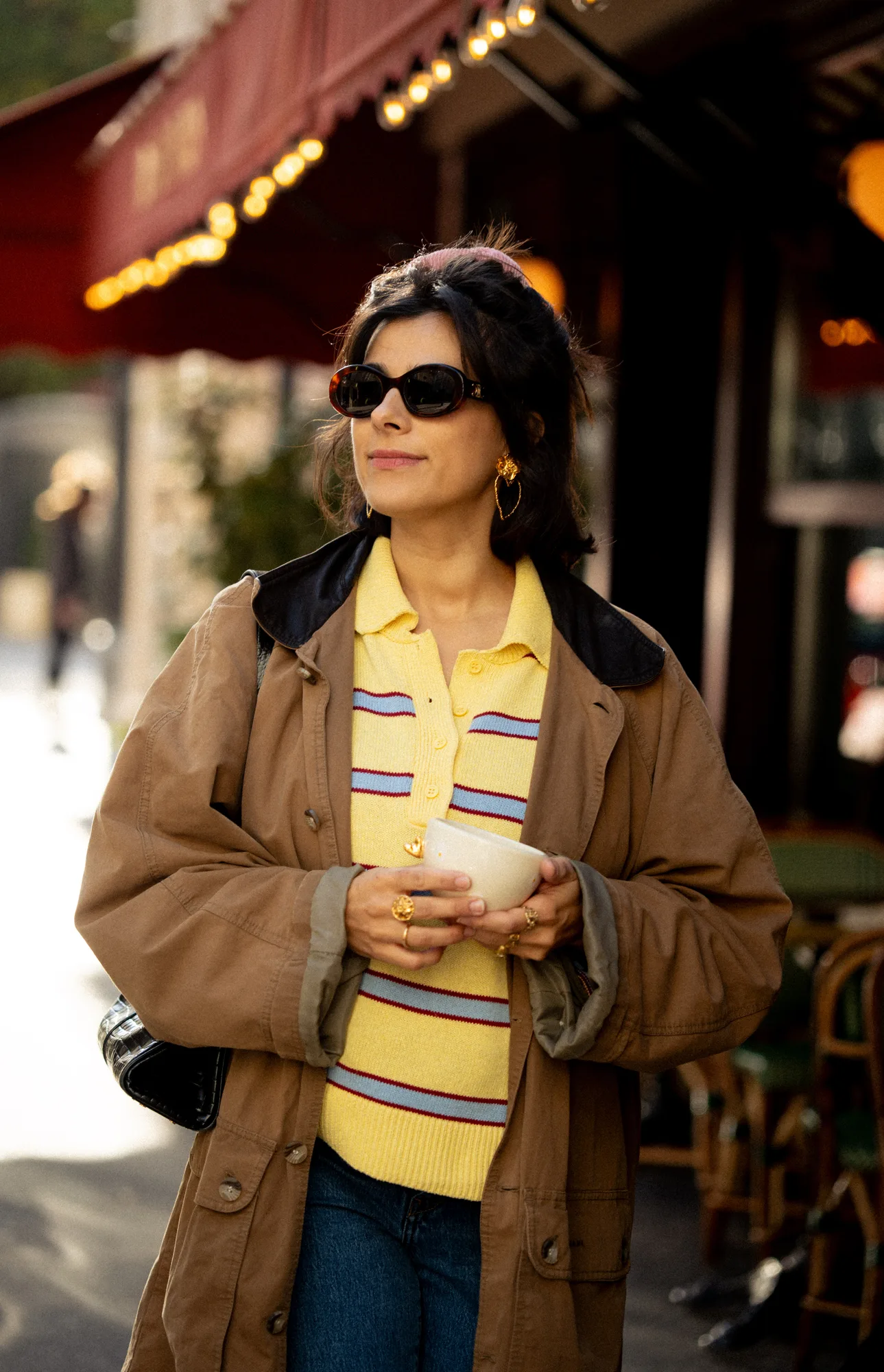
The new art direction in pictures: her studio, her ceramics, her hunted-down silverware, set on the colours of her palette.